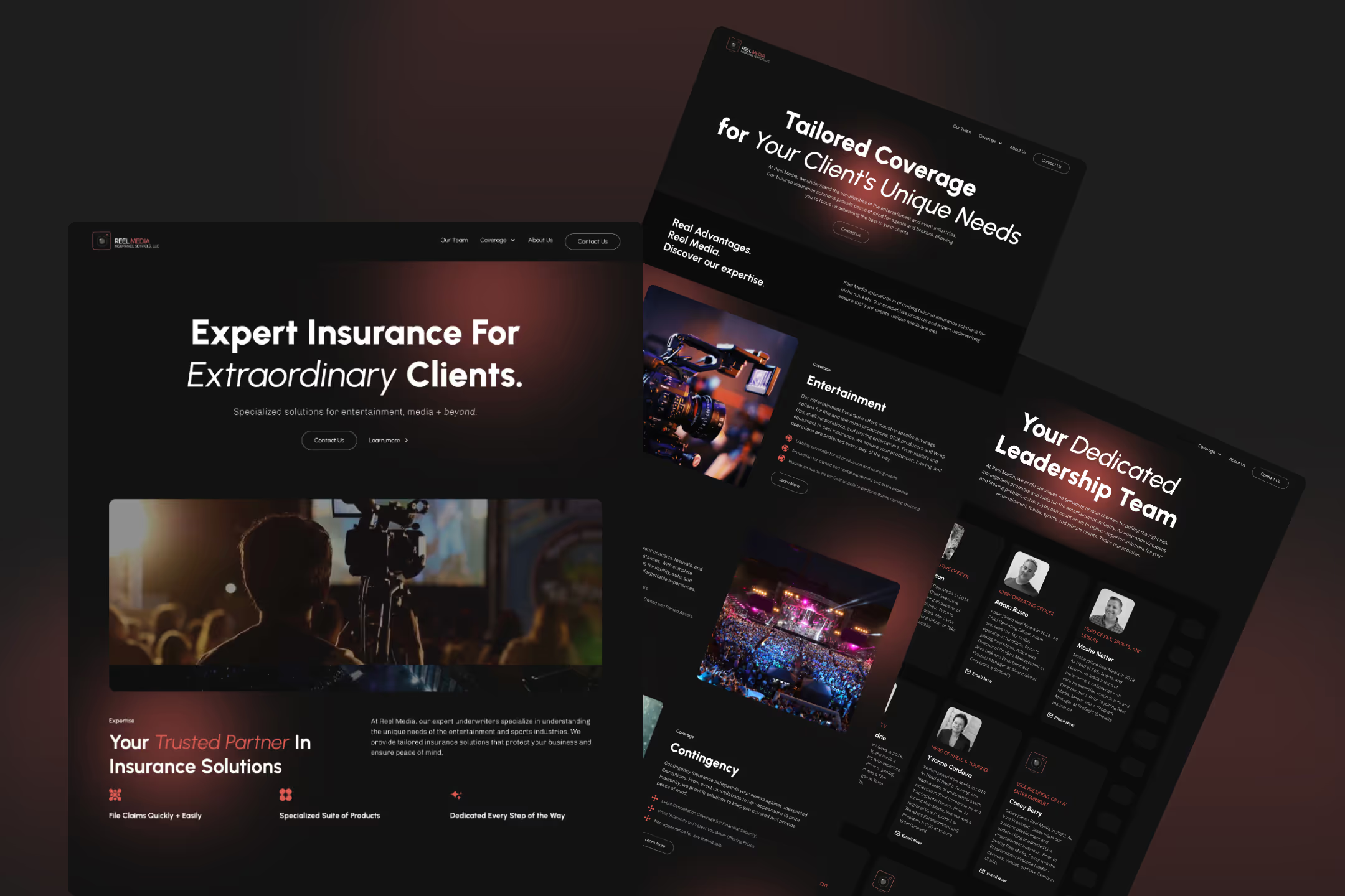
Sexy insurance website
A full Webflow redesign for an insurance agency working in entertainment. Simple, confident, and built to reflect their world.
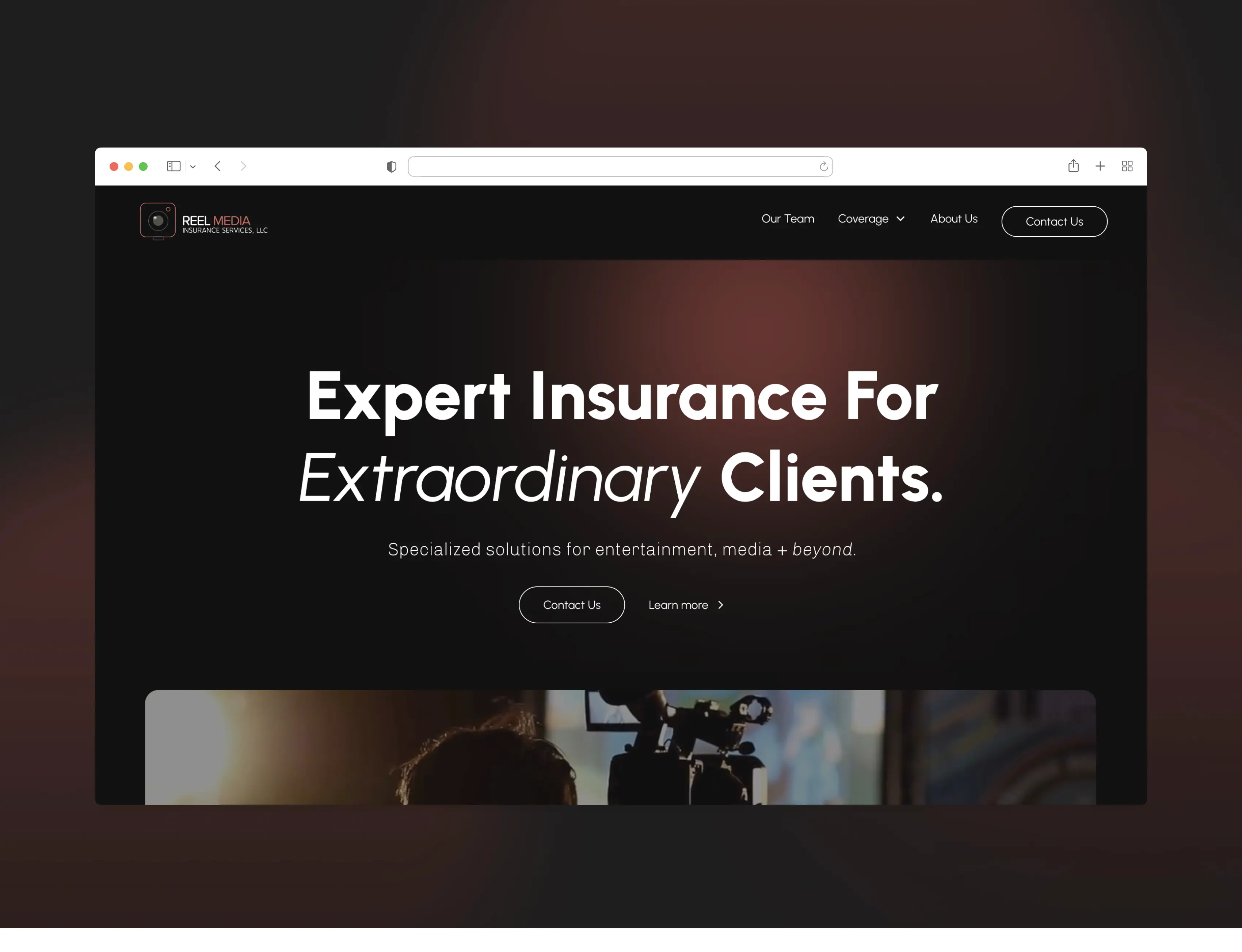
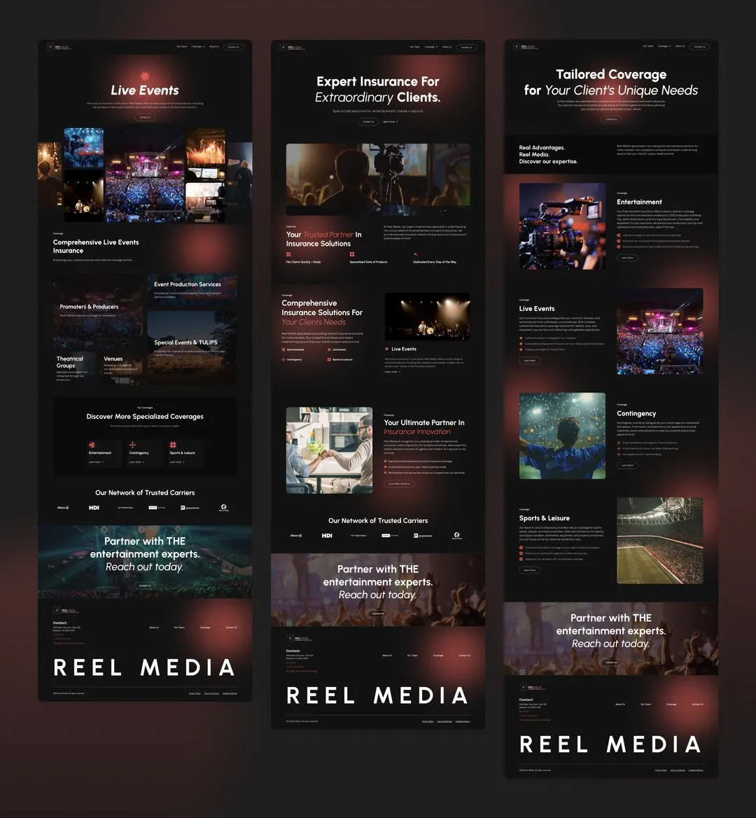
Reel Media helps entertainment clients find tailored insurance solutions. From stadium coverage to injury protection for athletes, they needed a site that reflects who they serve and how they work.
How to combine the two worlds
The main challenge was to translate the world of insurance into something that speaks to the entertainment industry—without losing credibility or going too far in either direction. The goal was to keep it professional and clear, while still delivering unique interactions and custom animations within a tight timeline.
Reel Media needed a site that:
- Felt confident and cool without being too flashy
- Connected to the entertainment world in a subtle way
- Was simple to navigate for both new and returning users
- Included interactive touches that felt intentional
- Made it easy to contact the right person on their team
A sexy insurance website
A clean and confident site built in Webflow, designed to connect the insurance world with the entertainment industry. I added layered interactions, multiple pages, and small details throughout to make it feel sharp, purposeful, and sexy.
Utalizing AI to speed up the process
The project started with a deep dive into the client’s goals, their target audience, and the unique nature of entertainment insurance.
- Ran client workshops to understand their services, tone, and positioning
- Looked at competitor websites to find opportunities to stand out
- Mapped out user needs and what returning brokers would look for
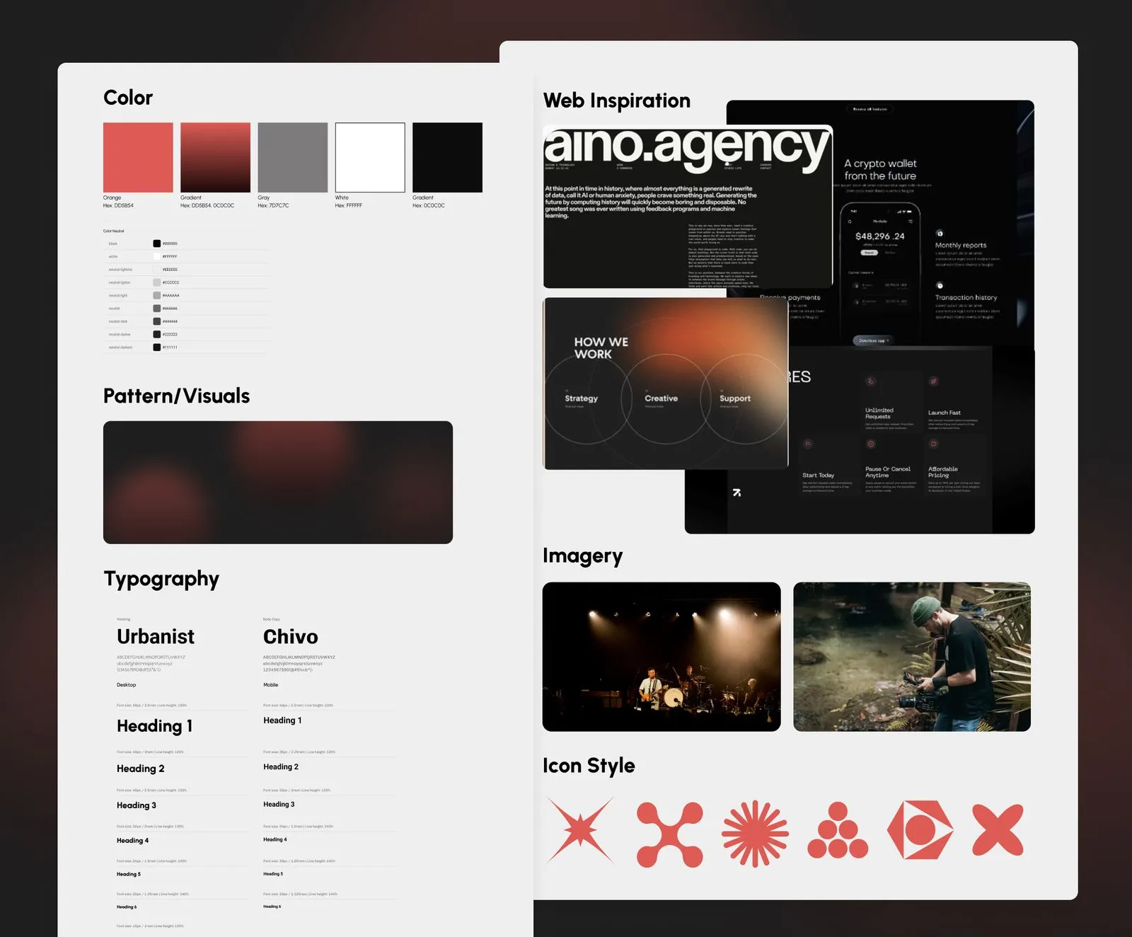
- Created a moodboard to lock in a visual direction that felt confident but not flashy
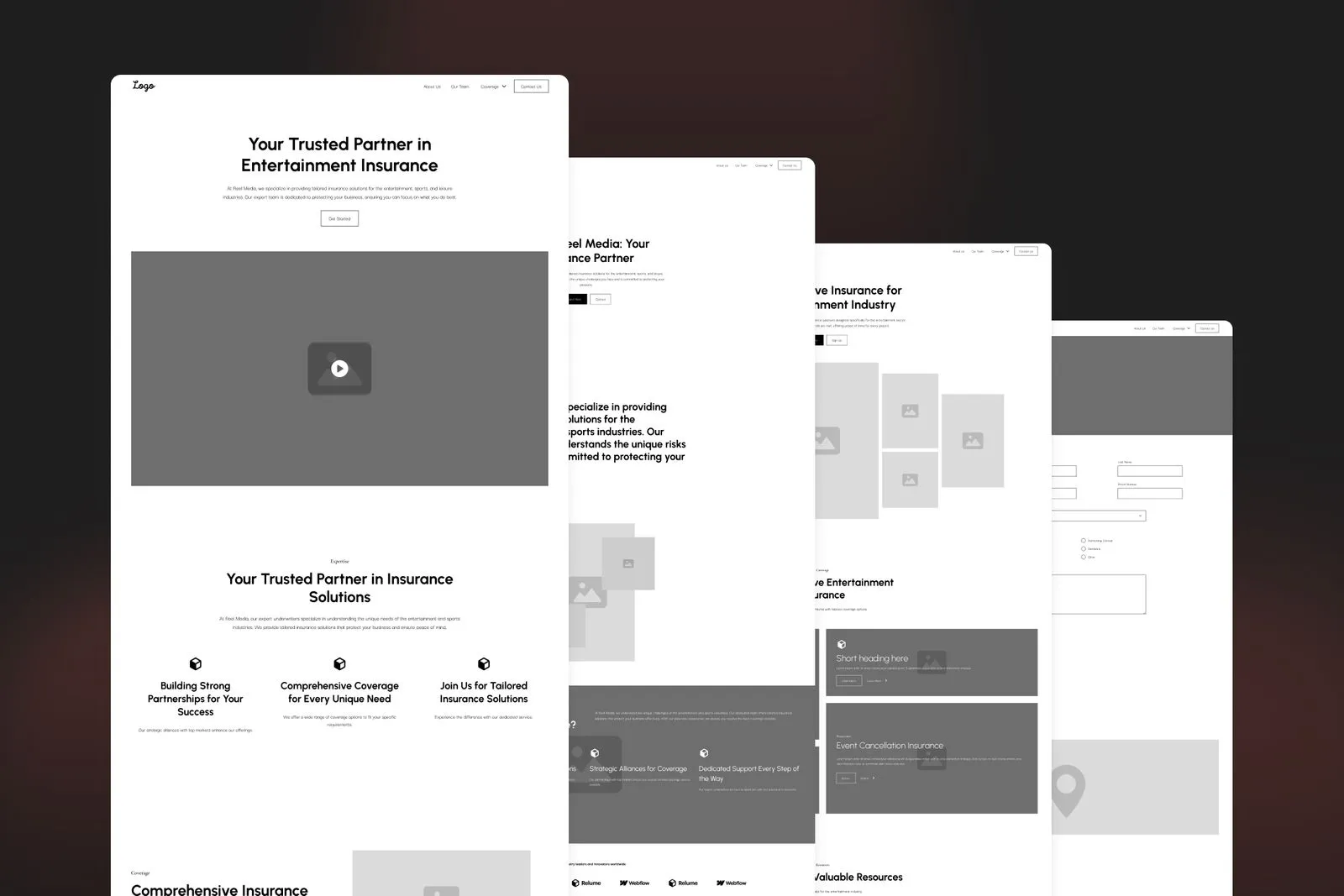
- Used the AI tool Relume to speed up the process: Sketched Sitemap and wireframes to define structure and content flow
- Brought everything to life in Webflow, including custom animations and responsive design
Design decisions to match the entertainment industry
For Reel Media, it was about bringing their connection to the entertainment world into the details, in a way that felt fresh, not expected.
This meant building something that felt professional but not corporate, playful but not over the top, and always easy to use. We focused on small, smart interactions that speak to their clients without distracting from the content.
The visual direction
The client wanted a site that felt different from the usual insurance look. They wanted it to feel moody, modern, and simple. We explored a few directions and refined the tone across several rounds. This is the final web moodboard we landed on, setting the foundation for a design
The details: Ready set go light
This growing glowing red light in the background, was inspired by a recording light, tying it to the entertainment industry. At the same time, the movement helps to draw attention to the focal point without being overwhelming.
The details: Modernized Teleprompter
This was inspired by a teleprompter, but make it modern. Rather than scrolling, it highlights the words. This also makes the text stand out and makes the information easier to absorb while connecting to the film industry.
The details: Film roll
Instead of a standard grid, the team cards are organised to mimic the look of a film roll. I thought this was a fun and unique way to connect to the entertainment world, and it also makes the page feel dynamic without being overcomplicated.
The details: Spotlight mouse
I designed a cool spotlight effect that follows the user’s mouse. I wanted to add a detail that, again, connects back to the industry, and I think this helps to create a more fun experience that feels on-brand and at the same time it helps draw attention to the details.
The industry icons
I wanted the icons to feel abstract and minimal, but still carry meaning tied to each industry category, very poetic.

Entertainment
The icon for Entertainment features a circular shape with triangles around it. This design was inspired by a camera lens opening, connecting directly to the visual and creative aspects of the entertainment industry. It symbolizes capturing moments and storytelling.

Live Event
For Live Event, I used a spiky star with 9 points. And in some cultures, the number 9 is linked to concepts of universal love and compassion, which are often central themes in live events that bring people together for shared experiences. The star also communicates the excitement and sparkles that you feel inside when going to a live event.

Contingency
The Contingency icon takes the form of a blob-like cross. So this abstract shape reflects the unpredictable and fluid nature of contingency planning, I’m thinking that it’s almost like molecules shifting under a microscope, and it can be very unstructured but still powerful.

Sport & Leisure
The Sport & Leisure icon is a square formed by four interconnected half circles. These could be interpreted as balls, racing tracks, or even a collaborative structure, and symbolizing teamwork. It also kinda looks like an abstract hashtag, tying into the concept of keeping score or your team number.
The Result
The final site gave Reel Media a fresh online presence that actually felt like them. Confident, sharp, and rooted in the world they work in. The client loved it, called it sexy (which I took as the highest compliment), and was genuinely excited about how different it felt from anything else in the industry.
- Multiple pages with a clear structure that’s easy to update
- Interactions and details that connect back to entertainment without being over the top
- A site that’s simple to navigate but still feels custom and one of a kind