Creative Community Platform
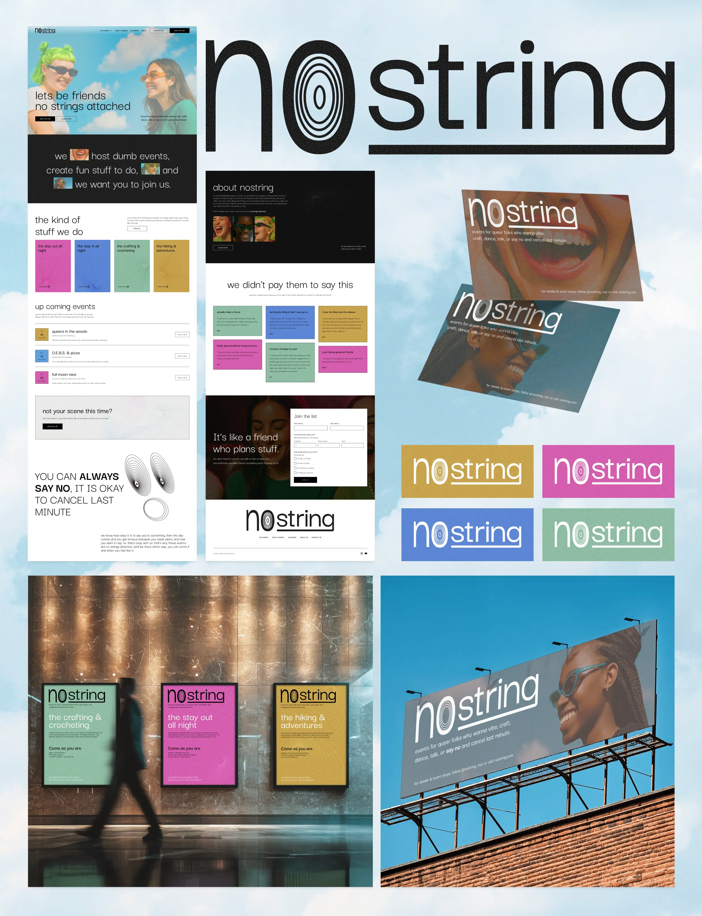
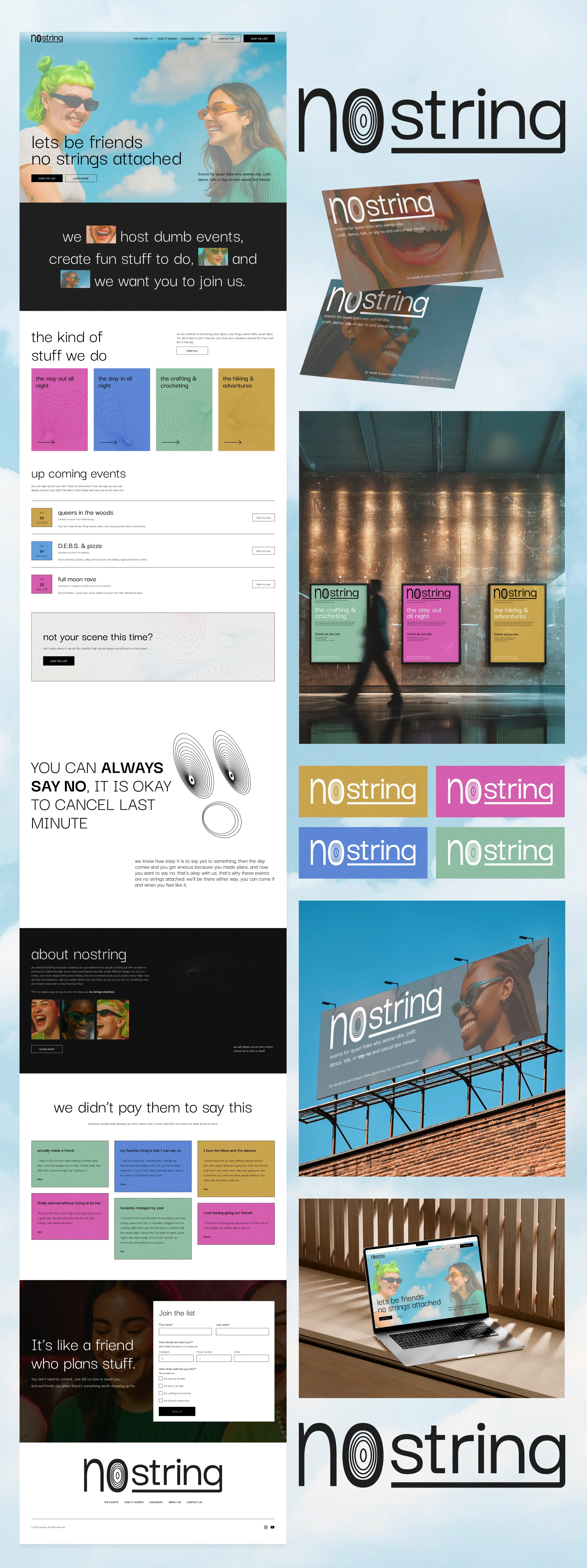
nostrings is a queer-led community platform built to help people connect without pressure, for friendships, creativity, and shared experiences. The goal was to create a space that feels open, playful, and genuinely welcoming.
The client needed a full brand direction and a homepage concept that could act as a foundation for something larger.
My role:
As lead designer and strategist, I worked independently across brand, UX, and visual design. I defined the creative direction, shaped the homepage structure, and designed a concept that could grow with the platform.
Designing something queer without it feeling like a performance
Design a brand and homepage concept that feels welcoming to everyone, colorful and abstract, yet clear in purpose. The identity needed to communicate queerness without relying on clichés, while making it easy to understand the different branches of the organization.
Key goals:
- A user-friendly website that’s easy to navigate
- Unique, playful branding that still feels intentional
- A visual language that clearly communicates queer identity and community
From research to concept in two days
This project was a 2-day design sprint, created as a starting point rather than a finished product. The goal was to move fast, define direction, and create something tangible that could be built together with the client over time.
Day 1
- Researched similar organisations and did a light competitor scan
- Created a moodboard and visual direction
- Positioned the brand in the market
- Shared early concepts and gathered client feedback
Day 2
- Refined the direction based on feedback
- Finalised the logo, branding, and homepage concept
Next steps would include refining the organization’s offerings and building out the full site. This case study shows the outcome of the sprint, not the final product.
A modern expression of queer joy and connection
The outcome (for now) is a one-page conceptual branding and homepage design.
The branding uses abstract shapes, bold colour, and subtle noise overlays to create a modern expression of queer joy, but less rainbow and more feeling. It draws on pride and community in a softer, more contemporary way. And its easy to built from.
What’s included:
- Homepage concept
- Branding direction
- A clear foundation for next steps: finalising offerings and building out the full website

the details that builds the brand
Visual system for theme clarity
Each event theme is distinguished by its own colour palette and abstract line art, creating clear visual separation while reinforcing brand consistency. On the site, the lines animate with a soft, breathing motion.
I wanted it to draw subtle attention without overwhelming the content. The goal was to add life to the section and help users intuitively understand the event categories at a glance, even though they are abstract.
reflecting identity and unity
I wanted the About section to feel a bit more alive, so I used a simple line animation where the lines pull apart and then come back together.
I thought that movement could reflect what nostring is really about: "we’re all different, we go our own ways, but there’s still space to come back and feel connected." It’s subtle, but adds something both visual and emotional to the section.
A gentle way to say no
To reinforce the core message that it’s okay to say no, I created an animation, that's slightly humorous to help make the message easier to accept.
It reinforces the idea that saying no doesn’t have to feel heavy or uncomfortable, while also leaning into the brand’s playful, silly side.

Final reflection
I love working on community-driven projects like this!
This was a fast, independent design sprint, and I love seeing how much can be shaped, within two days, when there’s a clear focus and genuine passion behind a project.
It shows how I work in fast-paced situations, balancing quick decisions with exploration and care. The project delivered what it needed to: a clear foundation that feels aligned with queer community values and leaves room to grow. It helped the client see themselves more clearly and gave us something tangible to build from.
This is an ongoing project, and more is coming soon.