Self-help App for young girls
A non-profit organisation had a problem understanding their users and why their self-help app wasn’t being used?!
This project focuses on understanding the underlying problems, creating design guidelines, and redesigning the existing app in order to create a better user experience that meets the user's needs.
How to get the app to be used
The main challenge was to improve the user experience and help Tjejjouren Väst understand why their app wasn’t being used. They needed deeper insight into their users' needs, behaviors, and motivations. My goal was to create clear design guidelines and a new interface that would actually support the people it was meant for — girls and young women aged 10 to 25. The app also had to feel safe, personal, and supportive in a wide range of situations, even in the most vulnerable moments.
About the client:
Tjejjouren Väst is a non-profit organisation that works to support and strengthen girls and young women. They offer online chat support with volunteers, through their website, and their self-help application - Stella.
A full app redesign that truly puts users first
A full app redesign that truly puts users first
This wasn’t just a visual refresh. It was a complete rethink of how a self-help app could better support girls and young women when they need it most. Backed by in-depth user research, the redesign focused on creating a safer, more personal, and more intuitive experience. From strategy and structure to visuals and tone, every part of the app was reimagined to better fit the users’ needs, behaviors, and emotions.
The solution included:
- A new app structure based on two key support needs: in-the-moment relief and long-term growth
- Full redesign of the interface to feel warm, relatable, and easy to navigate
- New onboarding flow that builds trust and lowers barriers to entry
- Personalized features like emotion check-ins, goal setting, and diary entries
- A community space designed to connect users safely and meaningfully
- Thoughtful content design to reduce overwhelm and avoid triggers
- A flexible design system to guide consistency and future development
- Usability testing with the target group to validate and fine-tune design decisions
The overall approach
This project followed a classic design process, from user research to prototyping, testing, and final design. The main focus throughout was to keep the user at the center of every decision, both big and small. It was an iterative process with constant learning, and every design choice was shaped by real user insights.
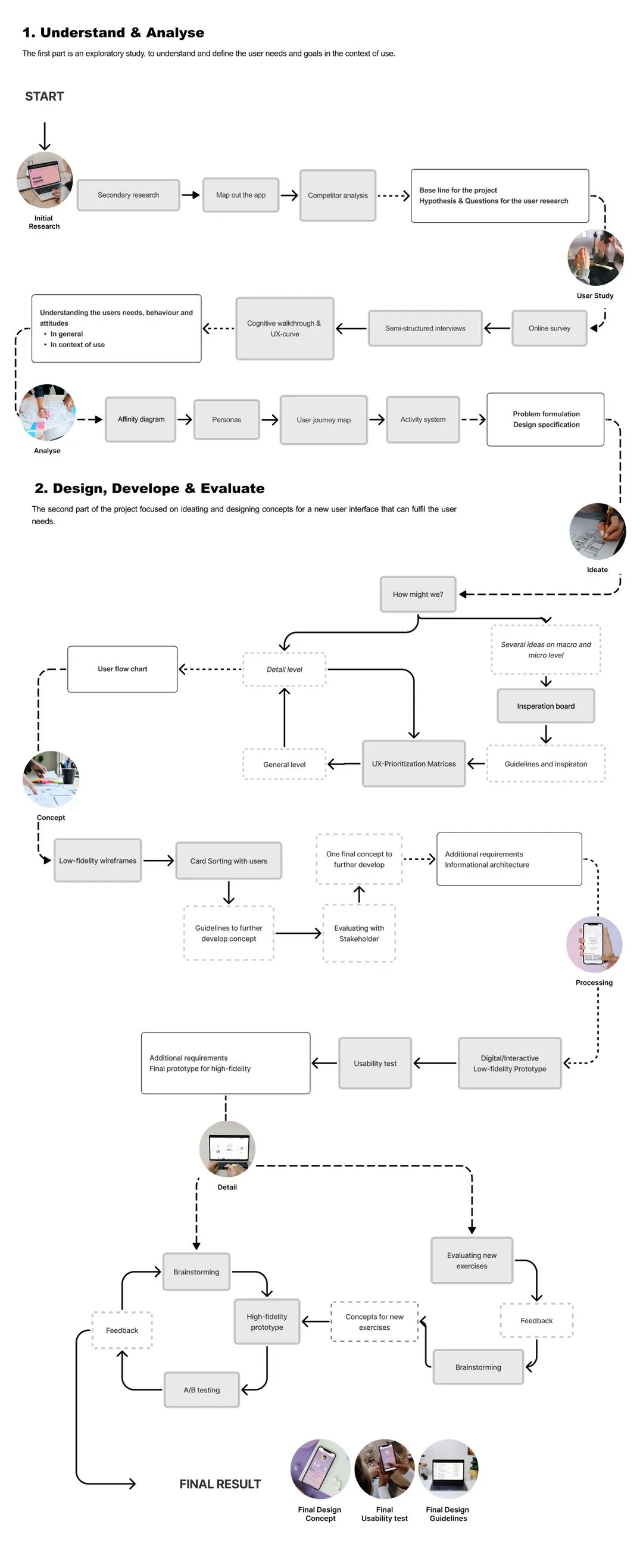
Digging into the users and their reality
I started by mapping out the existing product and getting to know the intended users.
The app’s purpose: To support girls and young women through difficult situations.
The users:
- Girls and young women, 10-25 years old
- They need help and extra support
- They want to use a mobile app
The problems the app needs to focus on:
- Self-harm
- Sexual Violence
- Panic & Anxiety
- Sleep Problem
- Substance abuse
- Stress & Worries

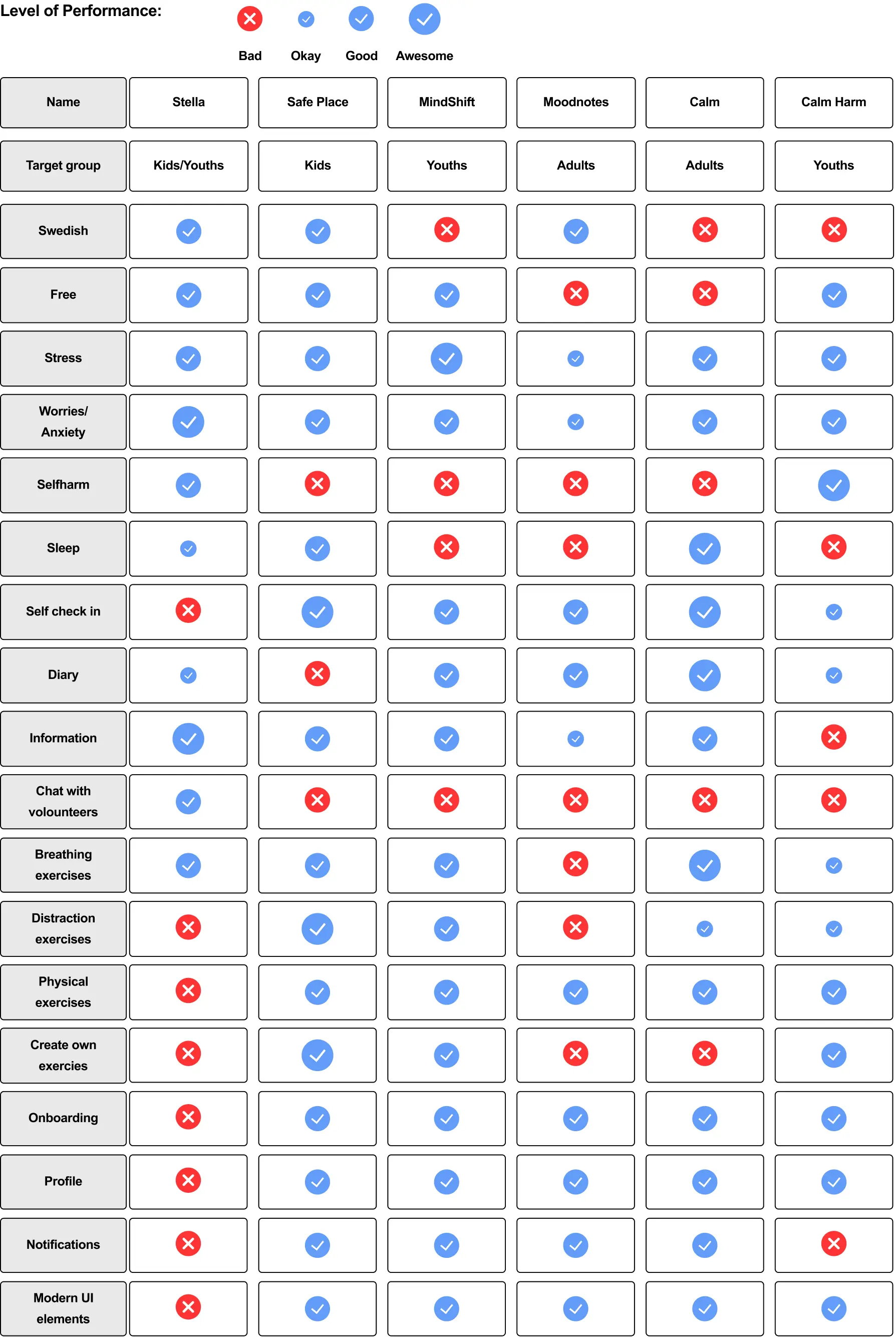
Competitor analysis
The aim of this competitive analysis was to get a better understanding of what to expect from a self-help app and to highlight potential problem areas in the current experience.
Approach
I compared multiple existing self-help apps using a visual scoring system — three sizes of checkmarks — to show how well each app performed in key areas. The larger the checkmark, the stronger the app’s performance in that specific feature or criteria.
Key Findings
- Most apps offered user interaction, creating a more active and engaging experience
- Navigation patterns were consistent, making the apps easier to use and understand
- Personalisation was a standard, helping users feel seen and supported
Outcome
These insights were used to form hypotheses and questions for the user study, helping shape the direction of research and design from an informed foundation.
User Study
After getting a better understanding of the current app as well as the market, by conducting competitor analysis, I started the big User Study!
The following methods were used to identify the users' needs, behaviours and goals.
Online survey
- 97 respondents
- 13-25 years old
- Users & Potential users
- 25 closed and open questions
Semi-structured interviews
- 7 Participants
- 17-25 years old
- 30-60 minutes
- All in Person
- Users & Potential users
Usability test
- 7 Participants
- 17-25 years old
- 60-90 minutes
- All In person
- Users & Potential users
The result I got was heartbreaking!
It highlighted how badly the user group was struggling... they are suffering from trauma, mental illnesses, and are extremely easily triggered.
I don't want to get better because then I wouldn’t recognize myself
I don't dare to use a self-help app, I'm scared my parents will see
Interesting findings:
- 75% had never used a self-help app before.
- The majority said that safety was the most important feature
- They get motivated by others
- Personalisation is a must for the user group
Usability test
During in-person usability testing, every participant expressed frustration with the app. They struggled to find key features, didn’t understand how to use it, and felt overwhelmed by how information was presented.
Despite liking the idea and content of the app, none of the users said they would use it themselves or recommend it to a friend.
Key pain points included:
- Don’t know how to use it
“I don’t even understand what to do, like where do I start?” - Mismatched mental models
“Oh, I didn’t even understand there were exercises. Where?” - Too much text
“Oh no! I feel so bad and stressed. It’s just too much text!” - Decreased motivation
“The colours are so boring. I would not use this if I feel bad.”
Affinity Diagram: Themes and Insights
I then analysed the data and organised it into themes, patterns, relationships, and important insights. This was one of the longest parts of the project, I had gathered so much data that I was completely overwhelmed... I had over 2000 objects in my Miro file!!
Users: General Problems
- Trauma
- Stress
- Anxiety
- Depression
- Easily triggered
Motivations:
Seek and receive help
- Connect with other
- Set goals
- Personalisation
- Posititivi
Missing:
Features and wishes
- Security
- Guide
- Calendar
- Notifications
- Goals
- Community
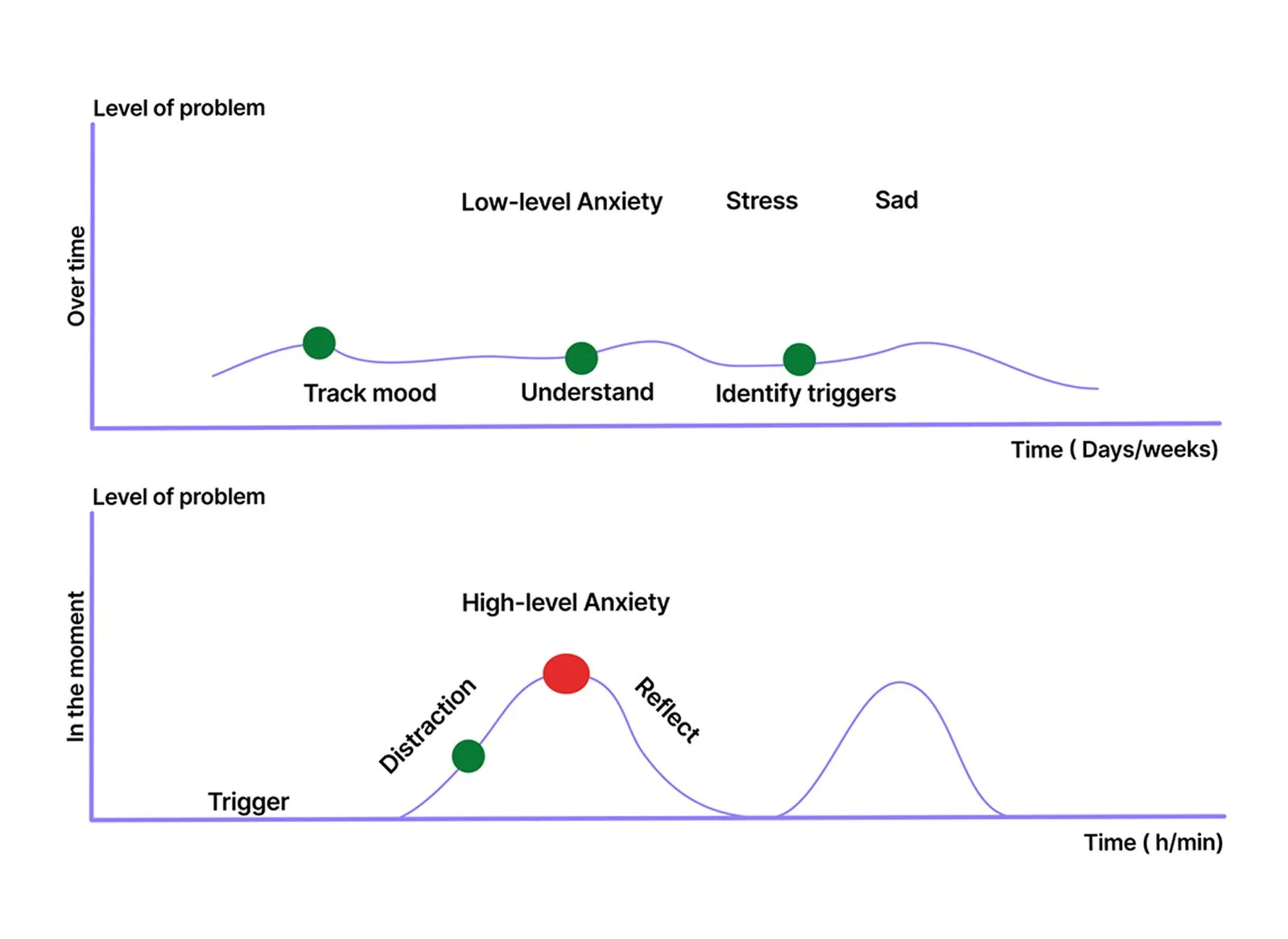
the Two Support Needs
I identified two distinct situations where users needed help:
- In-the-moment support
- Problem: Overwhelmed and unable to make a decision
- Need: A quick distraction or emotional reset to regain clarity
- Ongoing support
- Problem: Struggling to understand recurring emotions or patterns
- Need: Tools to reflect and identify emotional triggers over time
This distinction shaped the product strategy: the app needed to provide two types of support, one for real-time relief and one for long-term personal growth.
Why Users Often Don’t Seek Help
To design meaningful support, I also explored why young users hesitate to ask for help. I found key underlying reasons, both from a broader societal lens and within the app context.
- General barriers in society
- Lack of trust in others
- Lack of motivation to take the first step
- Context-specific barriers in a self-help app
- Fear or hesitation: users feel scared or unsure about engaging
- Lack of knowledge: users don't know how to begin or what the app can offer
These insights shaped how I approached trust-building, onboarding, and tone of voice across the product experience.
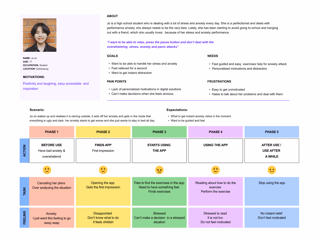
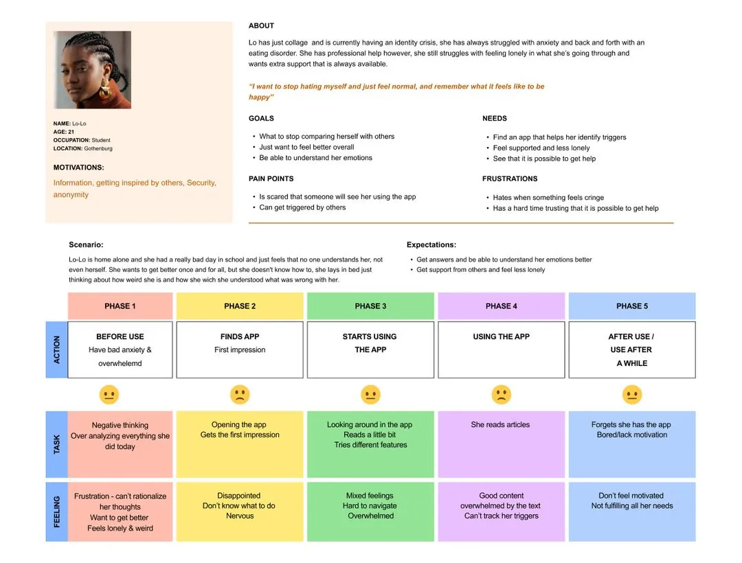
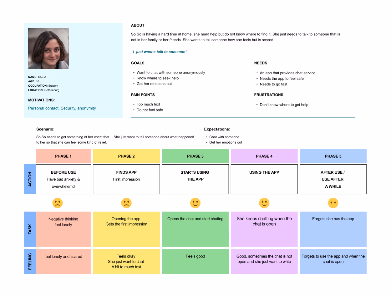
Personas and user journey
I know personas are out, but it did make sense in this project! So I created 3 Personas and User Journey Maps. The first step was mapping out the different personality traits that were found in the user study. I then found patterns and grouped the users together to find the most relevant personas and user journeys to represent the users.
The problem...
Finally, I was able to formulate a final problem statement. The main problem for why the app is not being used can be divided into two main groups: before use and during use, this project will focus on during use.
"Users are frustrated with the existing app because of poor navigation design and an impersonal expression. These concerns negatively affect the experience of the users."
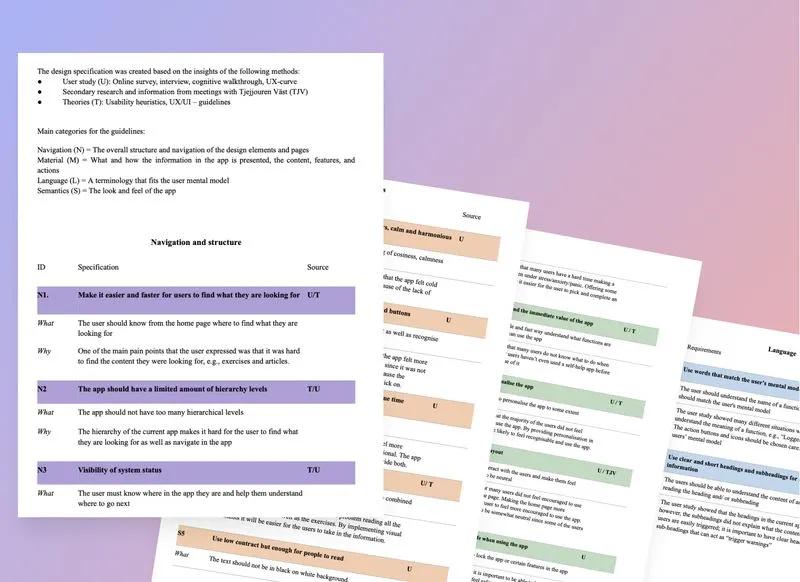
Design guidelines: Specification
I then created the initial design guidelines and specifications based on the information that had been identified. I then used the design specifications to ideate concepts in the next part of the project.
I identified four main categories for the guidelines:
Material (M) = What/how the information (content/features/actions) in the app is presented
Semantics (S) = The look and feel of the app
Language (L) = The terminology that fits the user's mental model
Navigation (N) = The overall structure and navigation of the design elements and pages
Ideate high and low
With a problem statement and design guidelines, I was finally ready to ideate, YEY!!! I started by rephrasing the different design guidelines into HMW statements and then ideated on each one.
I also ideated on other solutions than an app, like changing the whole healthcare system and creating new services. I had Ideas to use AR/VR, but after talking to the user group and client, it turned out it was not a good idea...
Limitation - it needs to be an app.
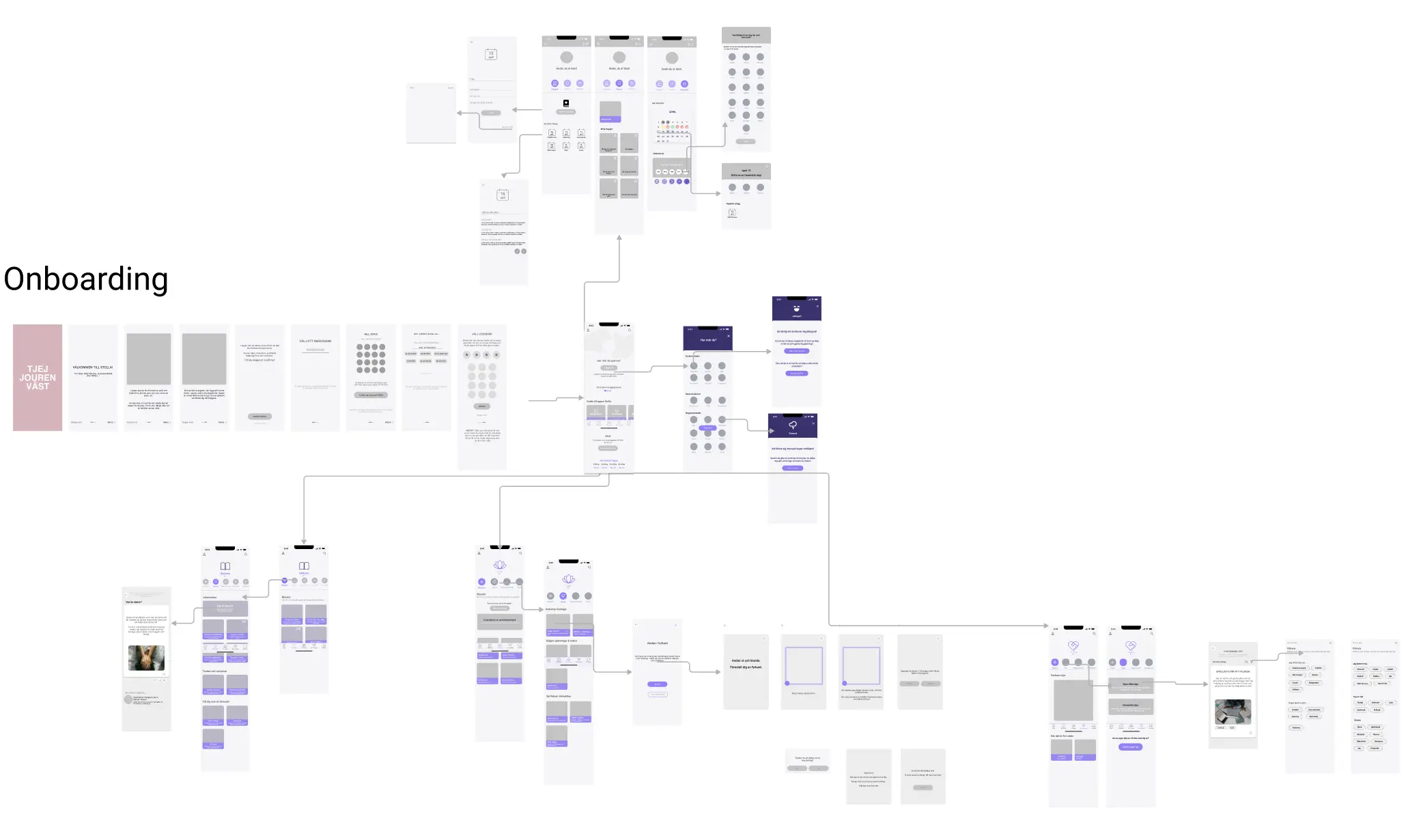
User-flow & Informational Architecture
After consolidating user insights and behavioral patterns, I led the restructuring of the app’s information architecture to clarify how core features interconnect within the system. The goal was to align the structure with the user's mental model, making navigation more intuitive and reducing cognitive load.
This included:
- Designing a new onboarding flow to establish early trust and guide first-time users
- Creating a modular navigation system that reflects how users move between key areas like exercises, community, profile, and settings
- Mapping and building end-to-end user flows that support real user goals — such as feeling safe, tracking progress, or customizing their experience
- Adding new sections (e.g. notifications, personalization settings, content library) and optimizing the flow between them to ensure functional clarity and emotional support
The restructured architecture not only improved usability, but also ensured that each feature fits cohesively into the overall system — supporting both short-term interactions and long-term engagement.
Wireframes and Card Sorting
I then started brainstorming and sketching Low-fidelity wireframes of the interface, mainly on the home page and the key features.
These were then tested using card sorting with 4 potential users:
The goal was to:
- Determine how the articles and general tips should be clustered
- Determine how the exercises and general tips should be clustered
- Decide on the names of the overall categories
Low firelity wireframes and testing 2.0
I then brainstormed and developed a digital, mid-fidelity prototype of the app, which I used for usability testing. The goal of the test was to identify usability issues and gather feedback on the overall navigation in order to further refine the concept.
Users:
The prototype was interactive and tested on mobile devices.
- 17-20 years old
- 5 Potential users
- Did the usability test on the old version of the app
Designing and testing
After the usability test, I started designing the high-fidelity prototype in detail. However, I found it hard to make detailed design decisions…
Therefore, I created a user design panel, the aim was to extract information as a basis for all my design decisions to comply with what the users actually want.
Users:
This was used to either get fast feedback on a design or a type of A/B testing, where I designed different alternatives and tested them with the user panel.
- 7 potential users
- 16 - 18 years old
Result:
The feedback from the testing resulted in decisions for the final design. This included design decisions for the home page, colors, backgrounds, and even down to a single emoji, icons and images for different cards. Here are two examples of the design decisions process:
How should the home page be designed?
- Use colours to make it more welcoming
- Avoid using words that could trigger
- Use Background to indicate morning/evening
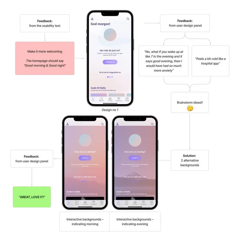
Should the pages be using background colours?
- Colours make it feel more cosy
- Different gradients for each key feature
- Colours and realistic images - create balance
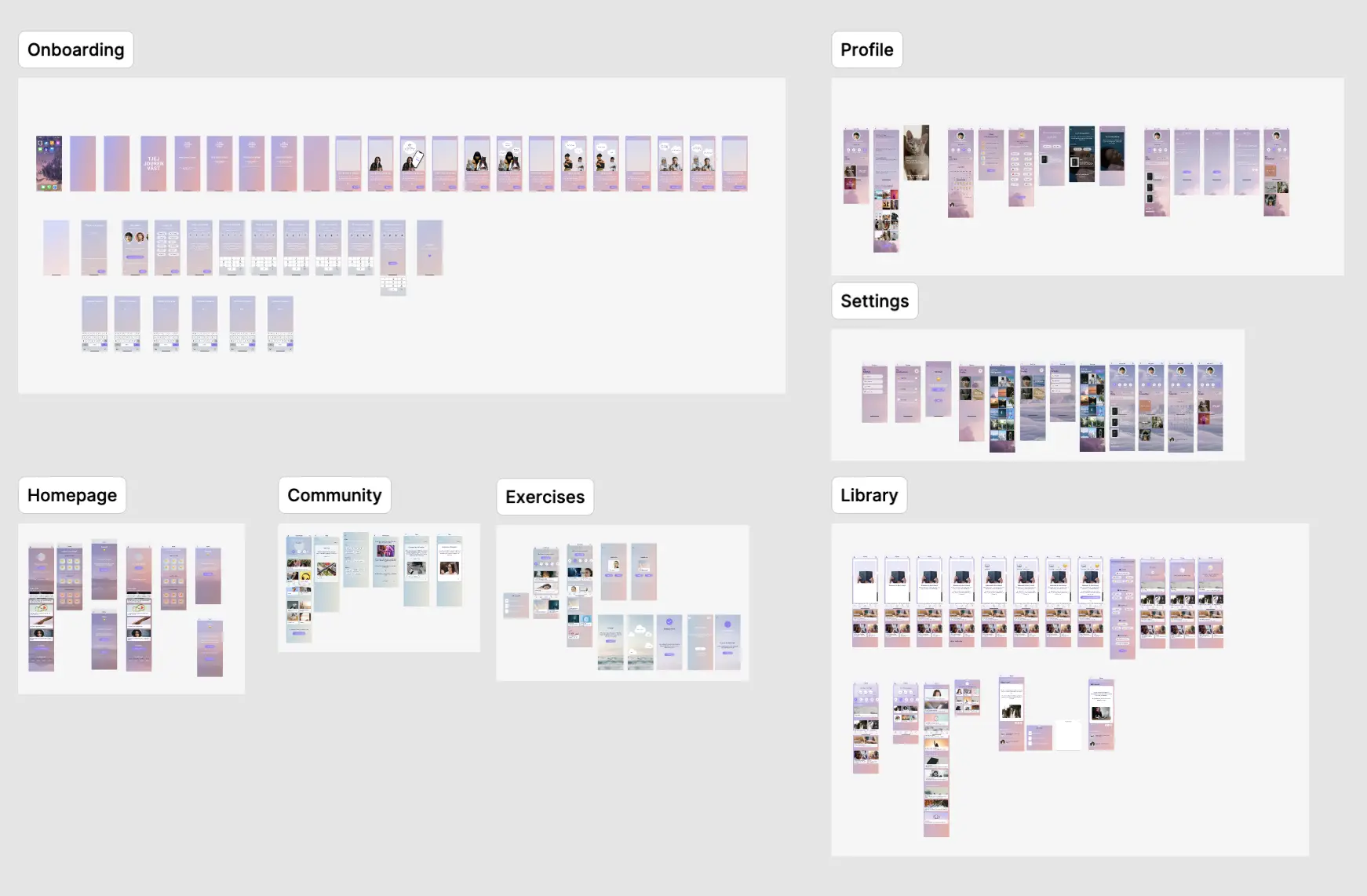
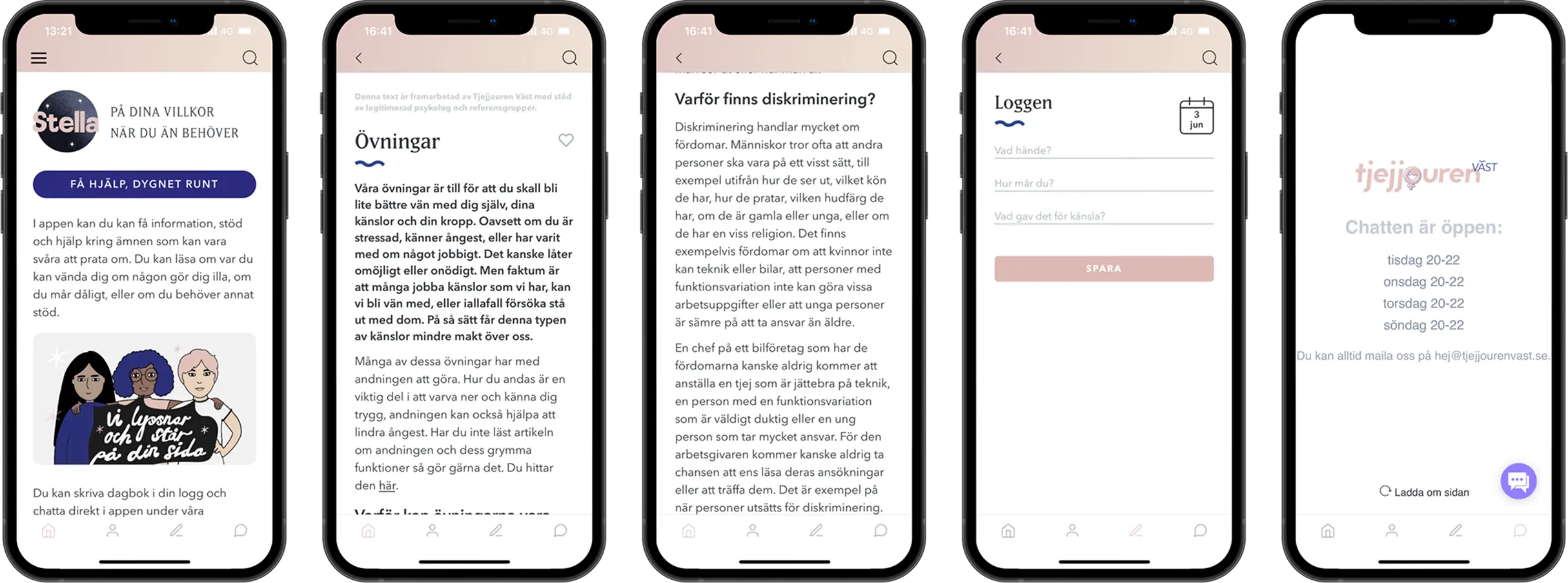
The Solution
The result is a fully interactive mobile app with a completely redesigned experience, from structure and visuals to tone and features. Every part of the app was shaped by real user insights and tailored to meet the emotional and functional needs of girls and young women. The new version feels safe, supportive, and easy to use, even in vulnerable moments.
The final result included:
- A clean, intuitive interface that centres the user experience
- New features like check-ins, emotional tracking, and goal setting
- A new onboarding flow and clearer navigation
- Customizable profiles, visuals, and content to feel more personal
- Added password-protected access for increased privacy and safety
- A consistent and accessible design system
PS: All copy was translated from Swedish to English to better communicate the concept to an international audience. The translation is not always 1:1, which resulted in some alignment inconsistencies in the final design.
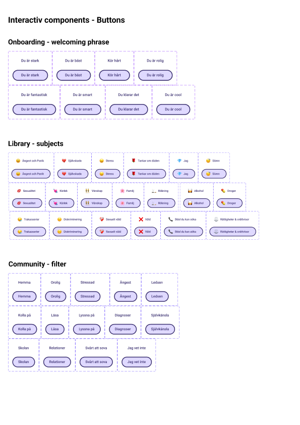
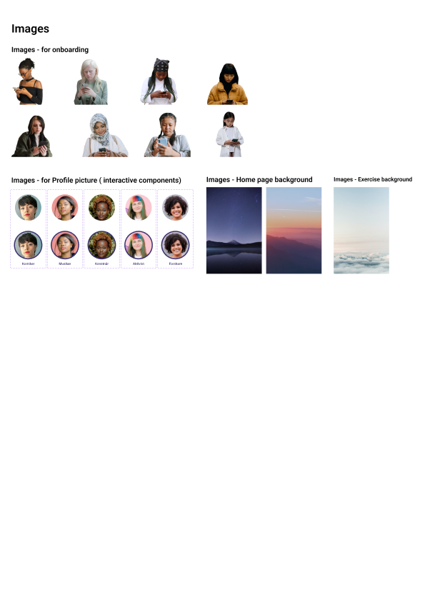
Onboarding flow
Let’s dive into the details of the app — starting from the beginning: the onboarding.
I designed a clear, accessible onboarding experience to build early trust, reduce drop-off, and guide users toward core features. The flow was structured around UX best practices: aligning with users’ mental models, minimizing friction, and supporting emotional safety from the first interaction.
Onboarding:
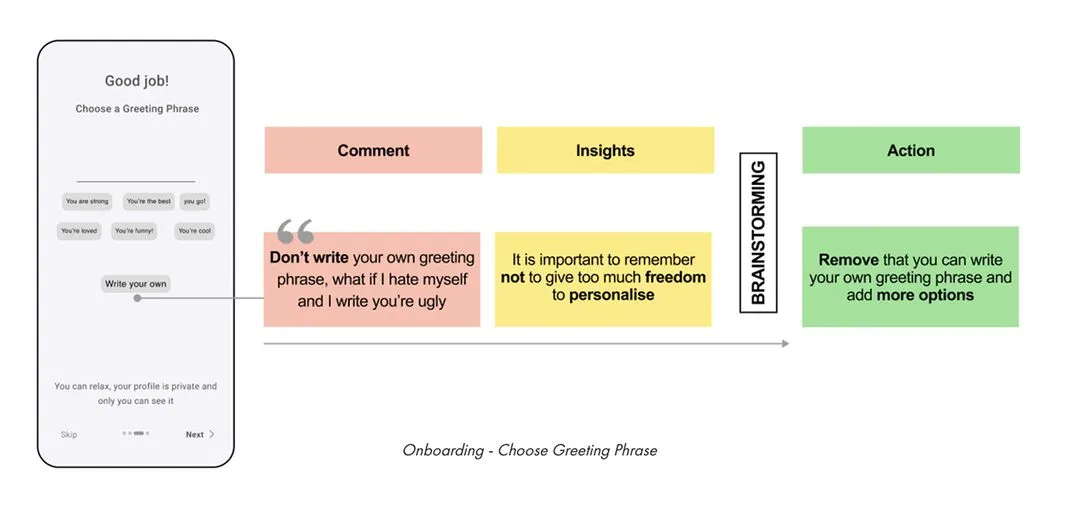
Making the Purpose Clear From the Start
PROBLEM:
User research showed that most people tend to skip onboarding — especially when they’re unsure what an app is or who it’s for. Without a clear introduction, users felt lost before they even began.
SOLUTION:
I designed an onboarding flow that uses animation to capture attention and guide users through the app’s purpose. By combining movement, relatable imagery, and clear language, the experience helps users feel informed, seen, and more likely to stay.
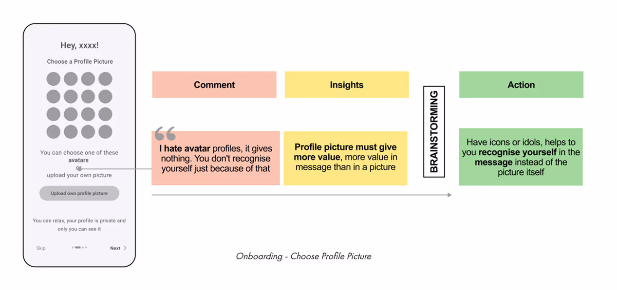
Onboarding:
Make It Personal and Safe
PROBLEM:
The app didn’t feel personal, which made it harder for users to connect with it in a meaningful way. Most importantly, users didn’t feel safe using the app, especially when dealing with sensitive topics.
SOLUTION:
I designed a fully customizable profile feature that lets users choose icons and inspiring female role models that reflect their identity. To support privacy, I also implemented a password-protection option, giving users more control and helping them feel safe while using the app.
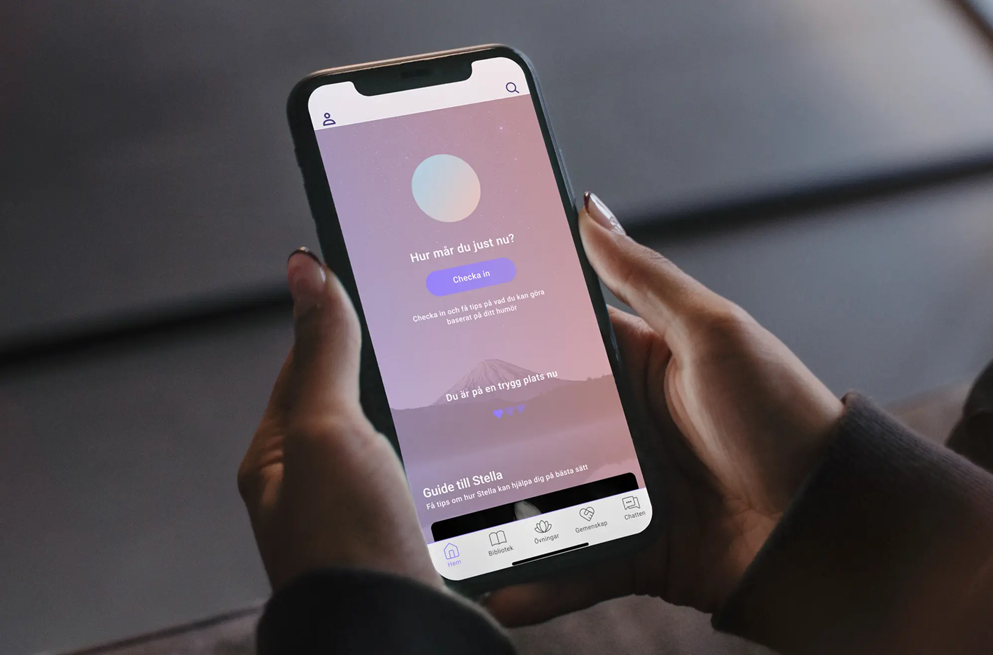
The homepage
After completing (or skipping) onboarding, users land on the homepage.
This screen was designed to feel calm, personal, and easy to start, offering gentle guidance through features like daily check-in questions and easy access to tools that support emotional well-being.
To ensure a sense of safety and accessibility, the emergency contact option is always visible, allowing users to reach out for help at any time.
Homepage:
Designed for Comfort and Clarity
PROBLEM:
Users didn’t feel welcome or emotionally connected to the app. The home page felt cold and confusing, and poor navigation led to frustration early on.
SOLUTION:
I redesigned the homepage to feel warmer and more personal, using color shifts to reflect time of day and reducing overwhelming text. I created clear visual paths to key features, using icons and labels that match users' mental models and designed guidelines that adapt to different user goals.
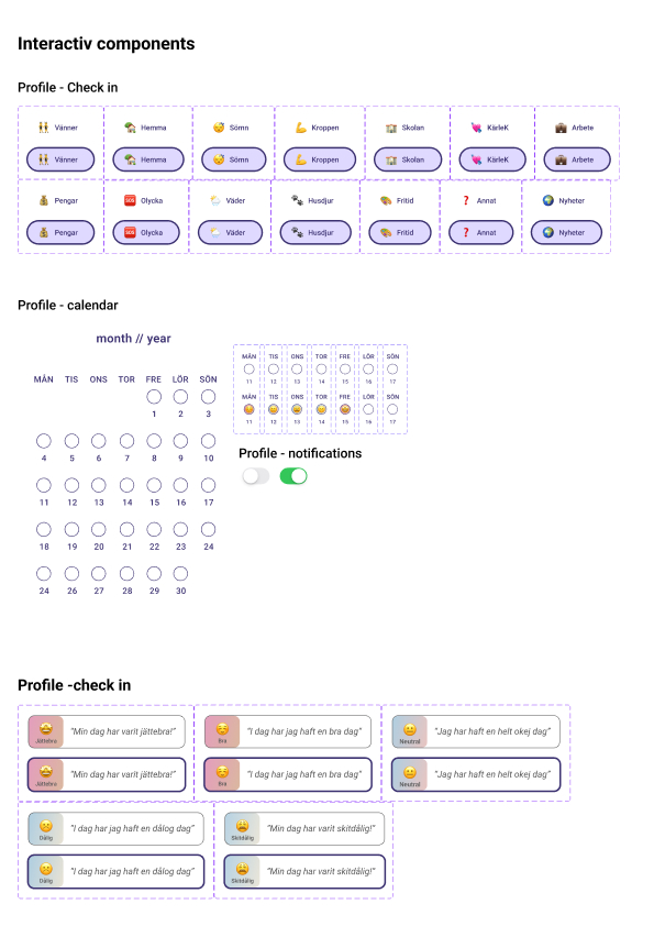
Check-In:
Emotion-Based Guidance
PROBLEM:
When feeling stressed, users didn’t know how to begin. The lack of guidance made it difficult for them to make decisions or choose what to do next.
SOLUTION:
I added a Check-in feature that helps users identify their current emotion and get personalized activity suggestions. Emotions are represented with familiar emojis, making the experience feel intuitive, light, and easy to start — even on hard days.
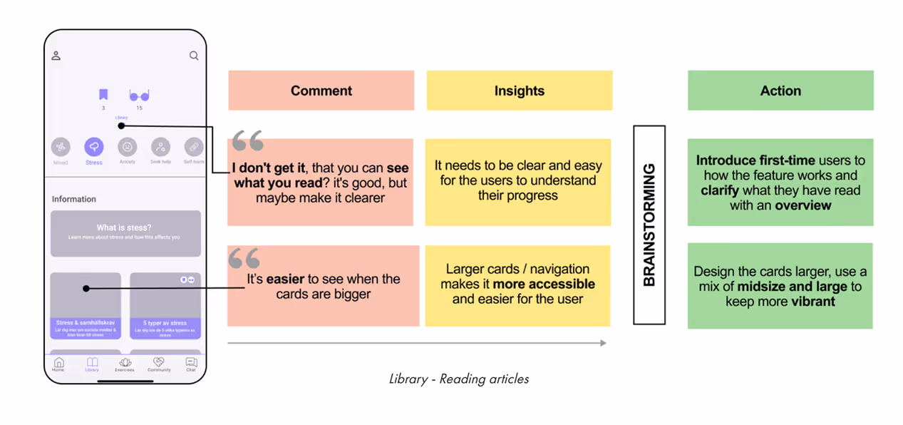
The Library
The Library is where users can explore all educational content and articles — including those carried over from the original version of the app.
To drive re-engagement and support learning over time, the Library was restructured into a news feed–style layout, surfacing the most popular and most recent articles. This dynamic approach adds vibrancy and encourages users to return regularly.
The experience also supports multiple content views for accessibility (such as list and card layouts), and includes features like save-for-later, reading progress tracking, and a progress overview — helping users build a sense of accomplishment while giving them control over how and when they engage.
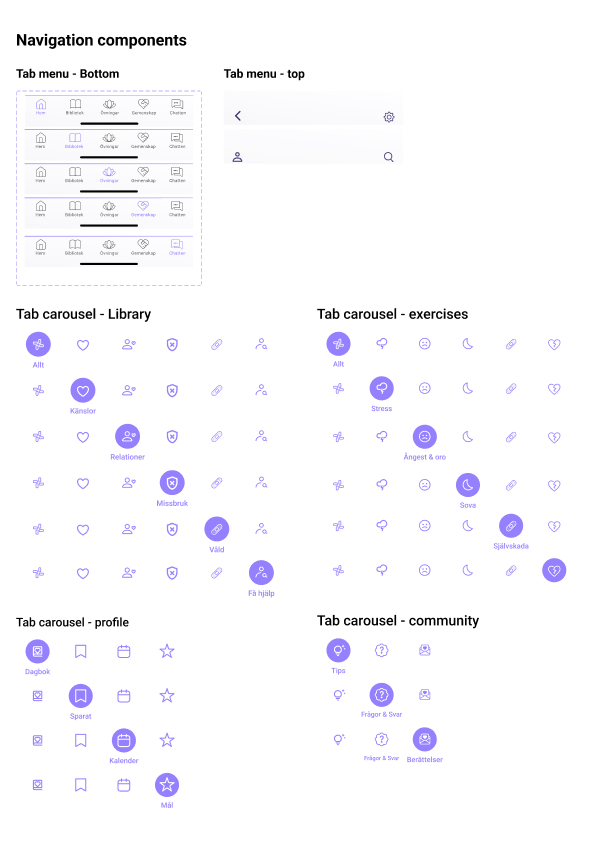
Navigation:
Simple Structure, Better Flow
PROBLEM:
Users had trouble finding the right content and often felt lost within the app, unsure of where they were or how to get back.
SOLUTION:
I redesigned the navigation to start directly from the home page, using a tab carousel that clearly organizes main categories. Each section now includes visual article cards, making it easier to explore and understand where you are in the app.
Article View:
Less Overwhelm, More Support
PROBLEM:
Articles felt overwhelming, especially for users who were stressed or anxious. The long blocks of text were hard to process, and it wasn’t clear how to save content for later.
SOLUTION:
I redesigned articles as bite-sized cards with limited text that users can swipe through, helping reduce cognitive load. For accessibility, users can choose to listen to articles read out loud, or view the full text if preferred. I also added a save-to-folder feature that reflects how users naturally organize information, making it easier to return to what matters most.
Progress:
Supporting Self-Guided Growth
PROBLEM:
Users lacked motivation to read articles and often missed out on helpful information that could support their wellbeing.
SOLUTION:
I added a progress tracking feature that lets users select topics they want to learn more about and visually see their knowledge grow. This creates a sense of progress, control, and motivation to keep going.
The Exercises
The Exercises section offers access to all activities from the original app, alongside a range of newly added ones. It uses the same scrollable news feed–style layout as the Library, making it easy for users to browse based on interest, relevance, or mood.
To reduce decision fatigue and support emotional regulation, users can also choose a randomized exercise, helping them get started without overthinking.
Each exercise is designed with a clear beginning and end to create a sense of completion, and the system can suggest exercises based on user needs — whether they’re looking to calm down, reflect, or reset.
This structure encourages regular use while respecting the user's emotional state and mental bandwidth.
Navigation:
Find the Right Support Faster
PROBLEM:
Users couldn’t even find the exercises in the old version of the app. The section was buried and unclear, leading to confusion and low engagement.
SOLUTION:
I made exercises accessible directly from the home page, and clearly divided them into main categories based on type and purpose. This helps users find what they need faster while avoiding content that could feel triggering.
Presentation:
Designed to Engage, Not Overwhelm
PROBLEM:
Exercises felt boring, text-heavy, and repetitive. Users weren’t motivated to complete them and felt limited by the lack of variety.
SOLUTION:
I designed five new exercises that focus on interaction and positive distraction, using illustrations, feedback, and limited text to make them more engaging and easier to complete.
Decision Fatigue:
Let the App Decide for You
PROBLEM:
One of the main challenges users faced was difficulty making decisions, especially when choosing an exercise. Feeling overwhelmed made it even harder to know where to start.
SOLUTION:
I introduced a new feature called “Surprise Me”, which randomly selects an exercise for the user. This removes pressure, adds a sense of ease and fun, and helps users get started without overthinking.
The Community
Research showed that users felt more motivated and inspired when they could connect with others going through similar experiences — especially those their own age. To support this, I designed a new feature called Community, divided into three sections:
Tips, Questions & Answers, and Stories.
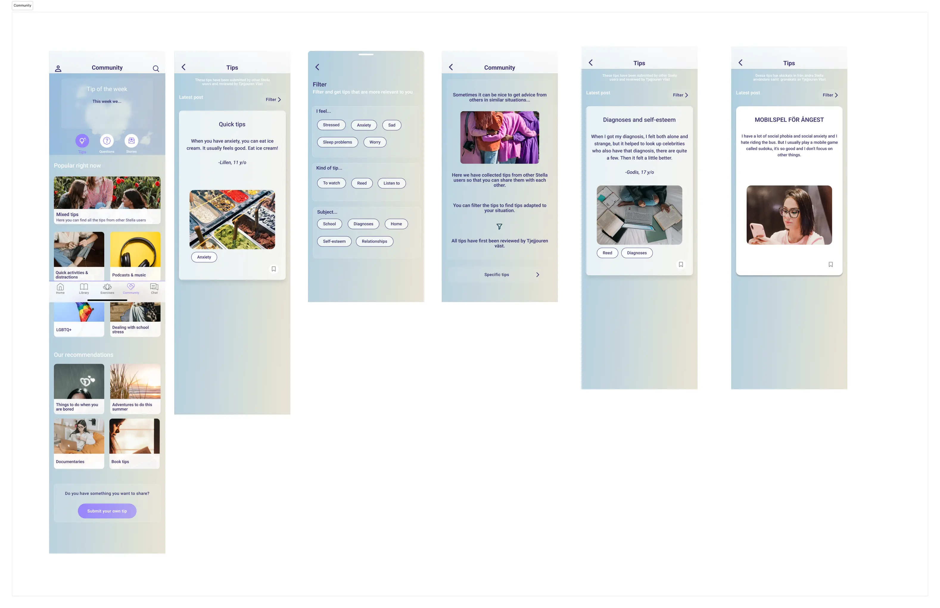
Connecting with Others:
Creating Motivation for Change
PROBLEM:
Users wanted to feel connected to others in similar situations. They needed the app to feel more interactive and alive — but there was also a risk of grooming, making safety a key concern.
SOLUTION:
I designed the Community feature where users can share stories and tips with each other in a safe, moderated space. All submissions go through Tjejjouren Väst for approval before being published.
To encourage return visits, I added a weekly tip section, and through A/B testing, we found that showing a user's name and age added value and relatability.
The Profile
Research showed that one of the main motivations for using an app is that it must feel personal. To support this, users can design their own profile during onboarding and access it easily from any main page. The profile is divided into four key sections: Favourites, Calendar, Diary, and Goals.
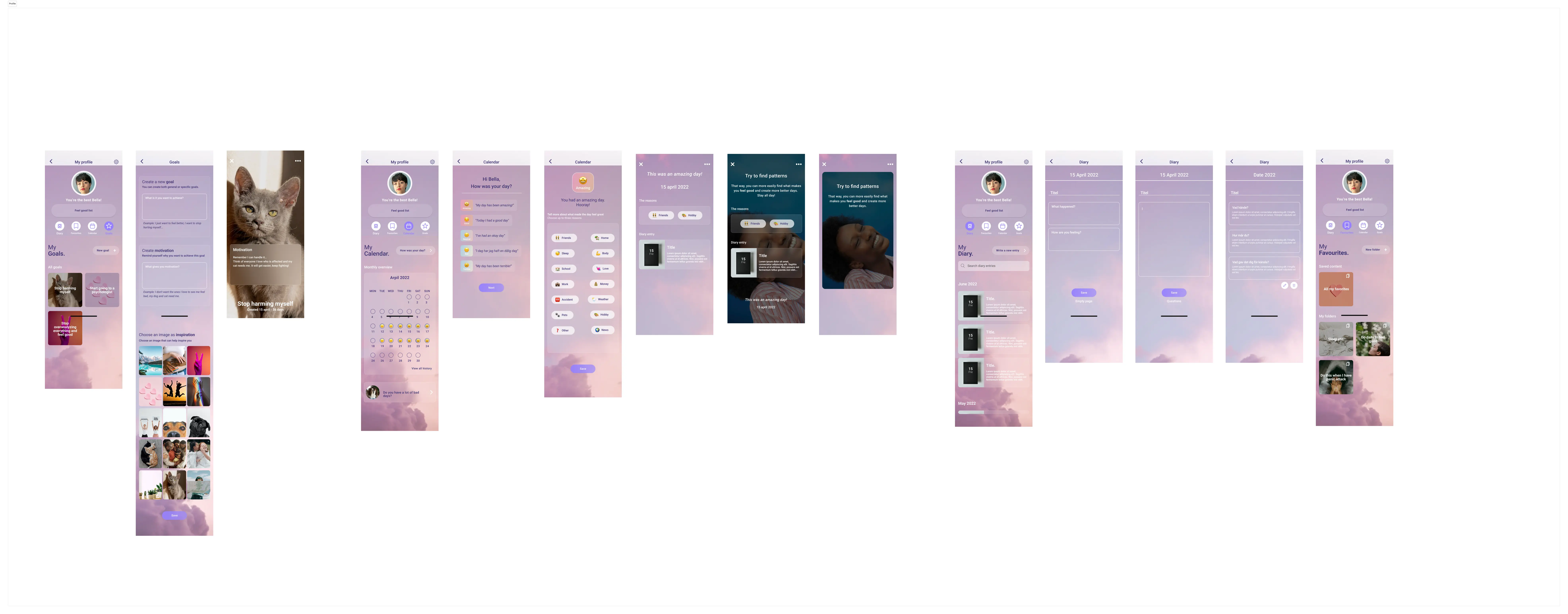
Saving Content:
Easy to Find, Easy to Return To
PROBLEM:
Users didn’t understand where their saved content was stored, which led to confusion and frustration when trying to revisit helpful material.
SOLUTION:
I added a “Save to My Favourites” feature and let users create their own folders using visuals and personal naming. This makes saved content easier to find, organize, and return to when needed.
Diary:
Flexible Writing, Clear Overview
PROBLEM:
Users had a hard time finding their old diary entries, and the writing format felt too restrictive. They wanted more freedom to express themselves.
SOLUTION:
I added a search function and quick overview so users can easily revisit past entries. They can now choose between guided prompts or a blank page to write more freely, depending on what they need in the moment.
Calendar:
A Clearer View of Your Mental Health
PROBLEM:
Users wanted a way to track their moods and identify emotional triggers over time. Without a clear overview, it was hard to spot patterns or understand what affected their wellbeing.
SOLUTION:
I connected the Check-in feature to the Calendar, allowing users to choose reasons for how they feel and get a quick visual overview. This makes it easier to look back, find patterns, and understand what contributes to a good or bad day.
Calendar:
Boosting Motivation Through Reflection
PROBLEM:
Many users struggled with low motivation. They often gave up quickly and stopped trying to improve, especially on harder days.
SOLUTION:
I added motivational messages that adapt to how the user is feeling that day. By using language directly inspired by real user quotes, the support feels more relatable and encouraging, helping users keep going even when it’s tough.
Calendar:
Encouraging Users to Seek Help
PROBLEM:
Many users lacked motivation and often avoided reaching out for help, even when they needed it most.
SOLUTION:
I made it easier to take that first step by adding a “Do you have many bad days?” card directly within the calendar. With just one tap, users can access helpful information and support, reducing the barrier to seeking help.
Goals:
Staying Focused on What Matters
PROBLEM:
Users wanted to work toward personal goals, but often lacked the motivation to stay on track or remember why they started.
SOLUTION:
I designed a feature that lets users set their own goals and receive gentle reminders rooted in their original motivation. This keeps the experience personal, focused, and easier to stick with over time.
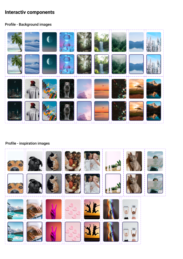
The Settings
Within the Profile section, users can access key account settings.
The focus in this flow is on personalization: users are encouraged to make the app feel more like their own by editing their profile and selecting a custom background.
Notification preferences are easily accessible, allowing users to tailor reminders and updates in a way that supports their individual needs without becoming overwhelming.
This section supports long-term engagement by giving users a sense of ownership and control over their experience.
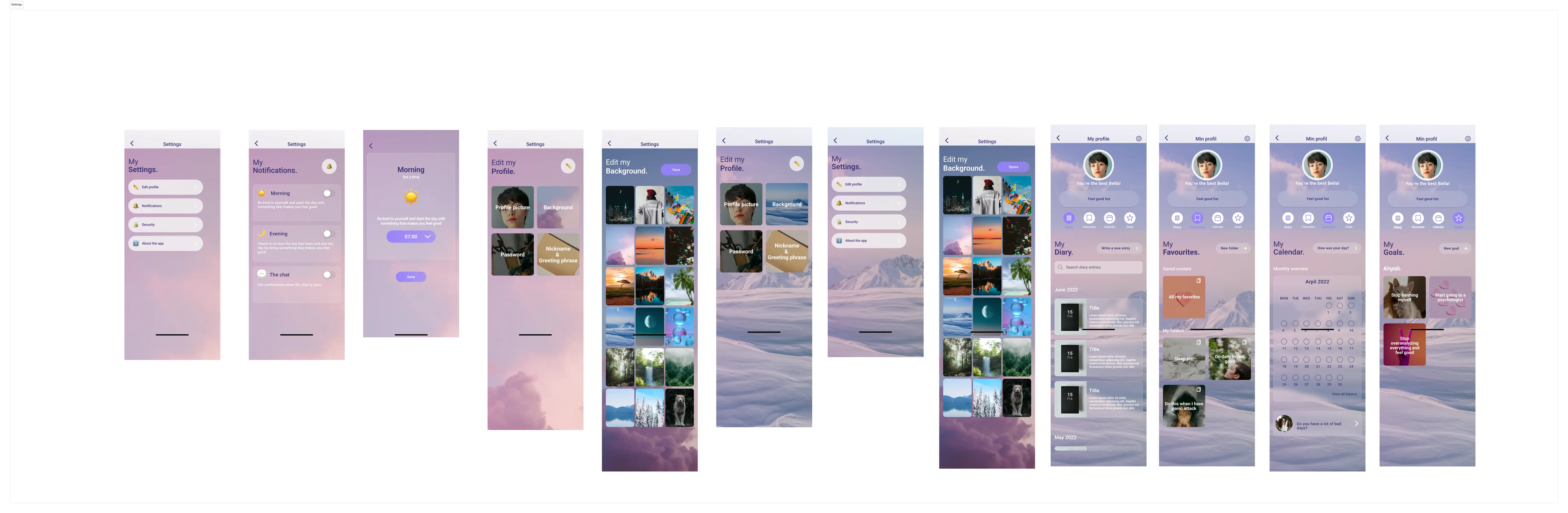
Settings:
Personalizing the Experience
From the top navigation bar in the Profile, users can access Settings, a new feature designed to support flexibility and control. Here they’ll find options for Profile Settings, Notifications, Security, and Information about the app, all in one place.
PROBLEM:
Users wanted more ways to personalize the app so it felt like their own , without making the onboarding flow too long or overwhelming.
SOLUTION:
I added a feature that lets users choose their own background image, helping them create a space that feels safe, calming, and uniquely theirs.
Notifications:
Gentle Reminders Without the Pressure
PROBLEM:
Users often forgot to use the app because they lacked a consistent routine. Standard notifications felt overwhelming or even triggering, causing some to avoid the app entirely.
SOLUTION:
I introduced a simple and low-pressure notification system with only three preset options. This helps users stay gently motivated and reminded, without triggering performance anxiety or adding stress.
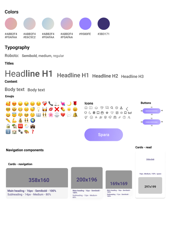
Design System
The design system provides clear direction for what should be included and how it should be designed, ensuring consistency across the app’s features, visuals, and interactions.
A final Usability test with all positive experiences!
A final usability test was conducted on the high-fidelity prototype. The aim was to evaluate and test the final design concept, functionality and usability.
Users:
All the users interacted with the prototype using a phone, while they were given tasks and questions as they were moving along. Each interview took between 30-90 minutes.
- 8 participants
- 11-20 years old
- All in person
The onboarding
Participants described the onboarding as easy and fun. They especially liked the use of icons and idols, which made the app feel more personal and likeable.
First impression
When opening the homepage, participants said they felt calm and welcomed. They appreciated both the colors and the imagery. Everyone was able to quickly navigate and find the key features, just from the homepage.
Library
All participants agreed that the Library was great. It was easy to understand how to save content, personalise the experience, and revisit what they had already read and learned.
Exercises
Participants liked that they could pick an exercise randomly, especially when feeling stressed. They appreciated that each exercise had a clear start and ending, which made it easier to follow and complete.
Community
Everyone responded positively to the Community feature. They liked how it was well-organised, and many highlighted that it felt like a valuable and important part of the app.
Profile
All participants liked the Profile section and its features. The settings were easy to understand, and users especially appreciated that they could change the background picture to make it feel more personalised.
Would you use the app or recommend it to a friend?
Every single participant said yes.
"YES ! I need this, and I want it now!"
The feedback was clear: users not only saw the value in the app, but they were excited about it!
Conclusions: A More Meaningful Experience
The results from user testing strongly indicate that the new interface significantly improved the user experience. It was consistently described as usable, accessible, and personalised, words that reflect a deeper connection between the design and the needs of the target audience.
This improvement was achieved by designing:
- A completely new interface
- A thoughtful and cohesive design system
- Updated features and navigation patterns
- Visual and functional elements that match user needs
Importantly, involving users throughout the process led to a more user-centred app — one that is not only functional, usable, and reliable, but also convenient, pleasurable, and meaningful to the people it’s made for.
Project Goals Achieved
The conducted tests confirm that the solution successfully fulfilled the core aims of the project:
- Improve the user experience of a self-help app designed for girls and young women
- Provide Tjejjouren Väst with valuable insight into their users’ needs, behaviors, and motivations
- Map out what and how to improve in the existing service to deliver greater value
- Formulate design guidelines and build a new user interface that enhances how users engage with the app Stella
Final Reflections
This project meant a lot to me, not just because it was my first end-to-end, independent UX/UI project, but because it focused on an issue I care deeply about. Designing something that could genuinely support young girls and women through difficult times felt meaningful, and I poured myself into every part of the process.
I learned so much about mobile design patterns, inclusive personalization, and just how much I love working in this space. The users were always at the center of every decision, and that human-first approach is something I’ll always carry with me.
The most challenging part was hearing about the trauma many users had experienced. It pushed me to be more thoughtful in how I designed, especially when trying to strike a balance between personalization and inclusivity for a user group spanning ages 10 to 25.
Overall, this project strengthened my passion for UX/UI and showed me the kind of work I want to keep doing: design that feels personal, thoughtful, and rooted in care.
Final thoughts:
The wellbeing of girls and young women must be a priority, not just in design, but in the healthcare system as a whole. It's not enough to provide basic functionality or surface-level support. They deserve real care, real tools, and a system that meets them where they are. Something more than just functional. Something meaningful.