A digital platform for funky Artist
Dani Massaad is a Swedish artist debuting his first album, a mix of 70s rock, musicals, and modern flair. He needed a simple but personal brand and website to share with labels and collaborators. And baby, I delivered.
My role:
As visual director, lead designer, and Webflow developer, I handled everything, from a small branding exercise that led to a simple logo and pattern, to the full website design and custom coding.
Keeping the music at the center
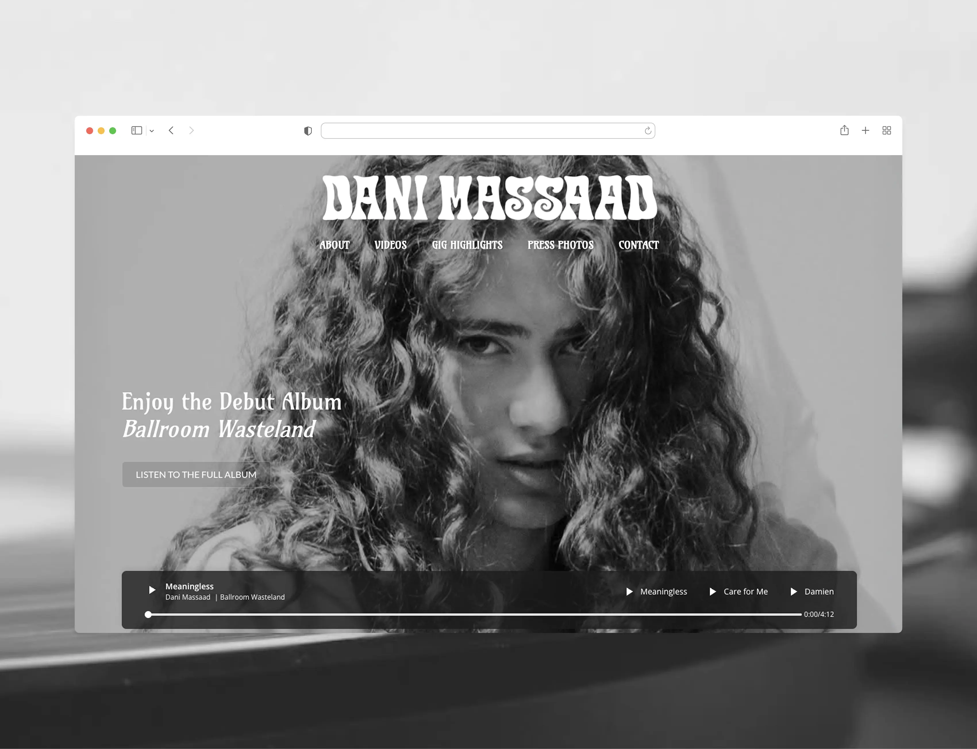
The main challenge was capturing Dani’s unique style in a way that felt modern but still reflected his 70s-inspired sound, all while making sure the music stayed front and center as users explored the site.
From research to concept in one ween
The project started with a meeting where we just listened to the music, and the client told me about his vision and needs for the website. The pace was fast; this was a jump-straight-in kind of approach. I listened to Dani’s music throughout the entire design process to stay in the right headspace (and luckily, it’s exactly my kind of music).
- Ran client workshops to understand what he wants, and he wants it groovy and funky, but classy
- Mapped out user needs and what records labels would value and look for
- Created a moodboard to lock in a visual direction
- Created logo and pattern design
- Sketched Sitemap and wireframes to define structure and content flow
- Brought everything to life in Webflow, including custom animations and responsive design
The artsy extra grovy
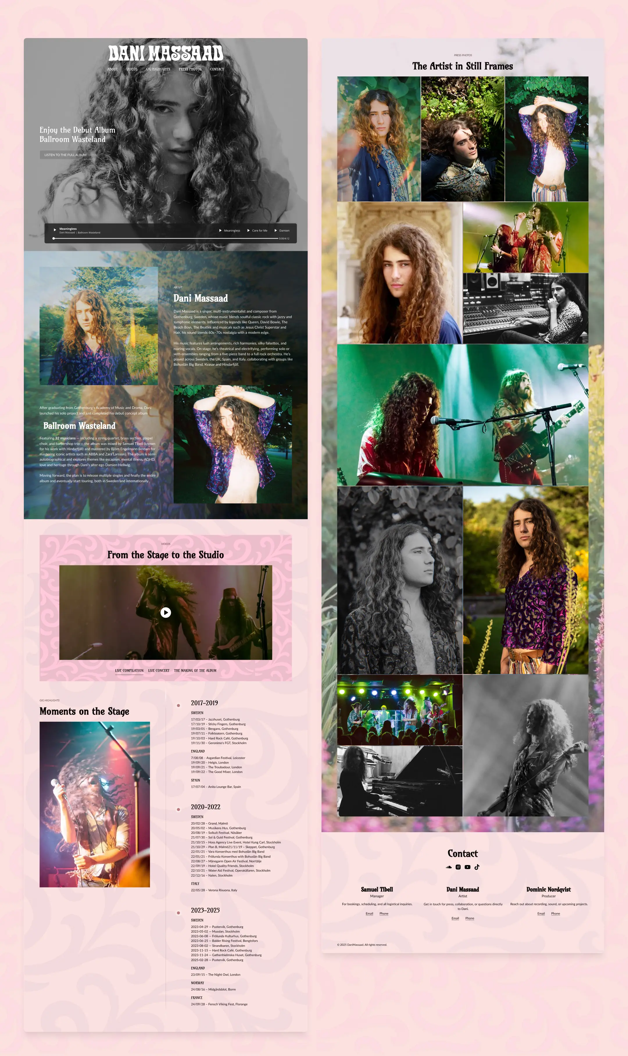
A simple, easy-to-navigate website that keeps the music front and center, thanks to a custom sticky audio player. The design feels modern while still nodding to the nostalgic 70s style in Dani’s sound, easy to duplicate and update the 12 music versions of the site. The branding includes a logo and pattern design, inspired by the artist's style and overall visual direction.
The album is not yet out, so this is a privilege to view.
Never sop the music
From the start, I identified quick and seamless access to the music as one of the most important user needs, especially for managers and industry professionals visiting the site.
Initially, we considered placing the audio player in the hero section, but that quickly revealed a UX issue: users would have to scroll back up to pause or switch songs.
To solve this, I custom‑coded a sticky audio player that remains visible and functional throughout the page. This ensured that the music, the heart of the site, stayed accessible at all times, without interrupting the experience.
Gig highlights
To help music industry professionals quickly understand Dani’s performance background, I added a clean, scrollable list of past gigs.
It’s functional, scannable, and designed for decision-makers who are short on time.
Artist Gallery
We included a curated image gallery to give a more personal and visual impression of who Dani is, beyond the music.
From studio sessions to live shows, these images were carefully selected to showcase both range and presence, helping users connect with the artist emotionally and professionally.
Final reflection
This wasn’t a complex, multi-phase product case study, but a fast, independent build for a real artist with limited resources and a lot of heart.
For me, it reflects something just as important as enterprise UX: working closely with one person to translate their creative world into a user-friendly, intentional experience. It shows how I adapt quickly, work across branding and development, and stay focused on what users actually need, even in a passion project.
And honestly? I love music. Projects like this remind me why I got into design in the first place.