Reframing how self-help tools support vulnerable users
I led the end-to-end redesign of Stella, a mobile self-help app for girls and young women. Through research, I explored why digital support tools often fail in moments of emotional distress and proposed a clearer, lower-cognitive-load experience designed for vulnerable situations.
Although completed a few years ago, it still reflects values that guide me today. I’ve grown significantly as a designer since then, but the core thinking and impact remain deeply important to me.

420%
Increase in monthly active users
215%
Increase in organic app store downloads
100%
Would recommend the redesigned experience
100+
Users involved in research & testing
A bit of back story...
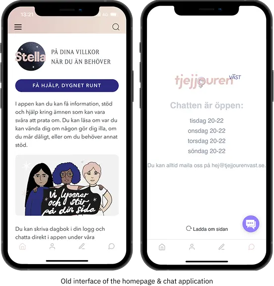
Stella is a self-help app developed with Tjejjouren Väst, a Swedish non-profit supporting girls and young women aged 10–25 through anonymous chat and resources around mental health, safety, and emotional distress.
Unlike typical wellness apps, Stella is used in high-risk, emotionally sensitive moments. Users often arrive in states of anxiety, panic, shame, or overwhelm.
Why it matters
At the same time, mental health challenges among girls and young women have been increasing. In Sweden, anxiety diagnoses are twice as common among girls and young women compared to boys.
Health organisations report growing demand for support related to anxiety, abuse, and serious mental health concerns.
Digital support channels, including chat services and self-help apps, have seen rapid growth, yet increased availability does not automatically mean increased accessibility.
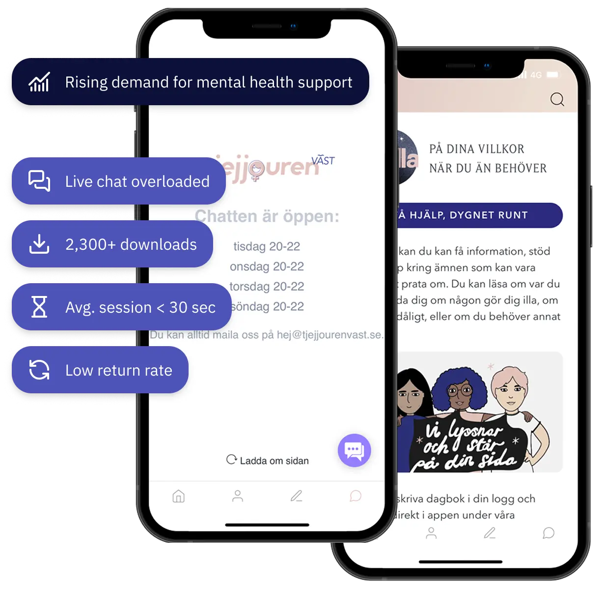
Tjejjouren Väst’s chat support was becoming overloaded, while the self-help app was underused. The organisation needed to understand why.
Self-help tools fail users in moments of emotional distress
Demand for mental health support was increasing, yet Stella showed minimal engagement. Despite 2,300+ downloads, sessions averaged under 30 seconds and repeat use was low, while live chat remained overloaded.
The issue was not lack of content, but accessibility. In moments of stress, reduced cognitive capacity made the interface feel overwhelming. The app did not support users when they needed clarity most.
This exposed a deeper challenge:
Why do self-help tools that work in theory fail in the moments they’re needed most?
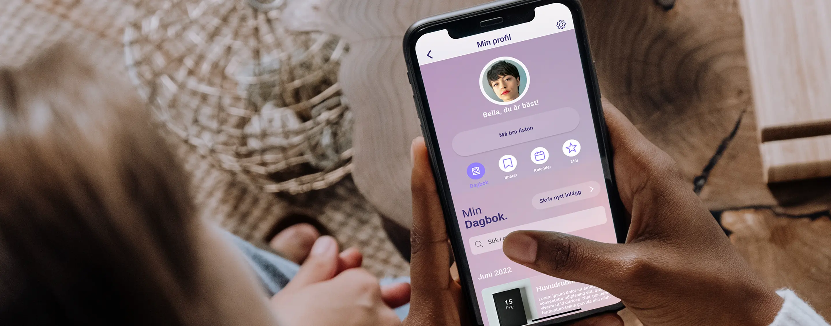
A self-help app that understands the users
The final outcome is a redesigned mobile experience that adapts to when and how users seek support.
Final deliverables (at a glance)
- New information architecture and user flows
- Design guidelines grounded in user insight
- UI style guide and component system
- High-fidelity prototype illustrating key use cases
- Validated interaction patterns for in-the-moment and over-time support
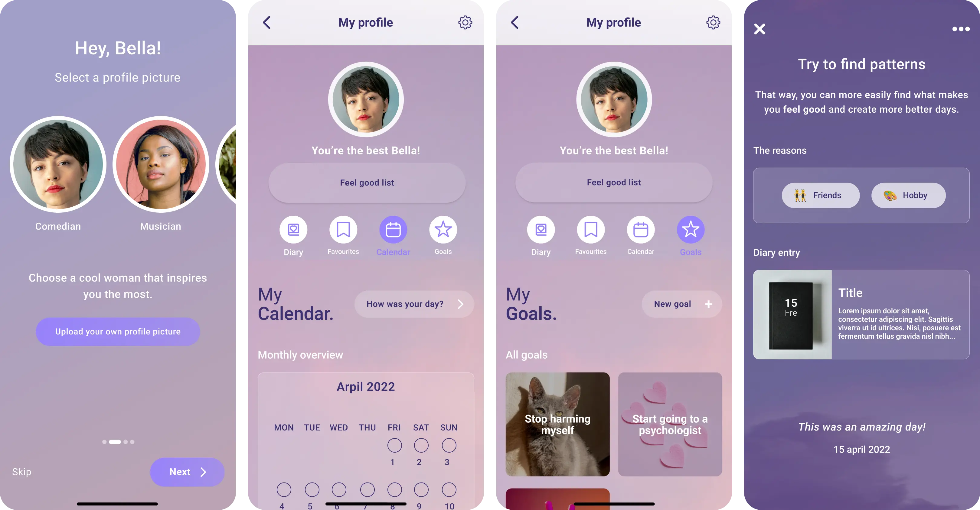
Clear Entry & Guided Paths
The user flow was redesigned to align with users’ mental models and emotional capacity.
- Simplified entry points
- One clear next step at each stage
- Content revealed progressively
- Structure aligned with users’ mental model
- New pages and features to support different needs

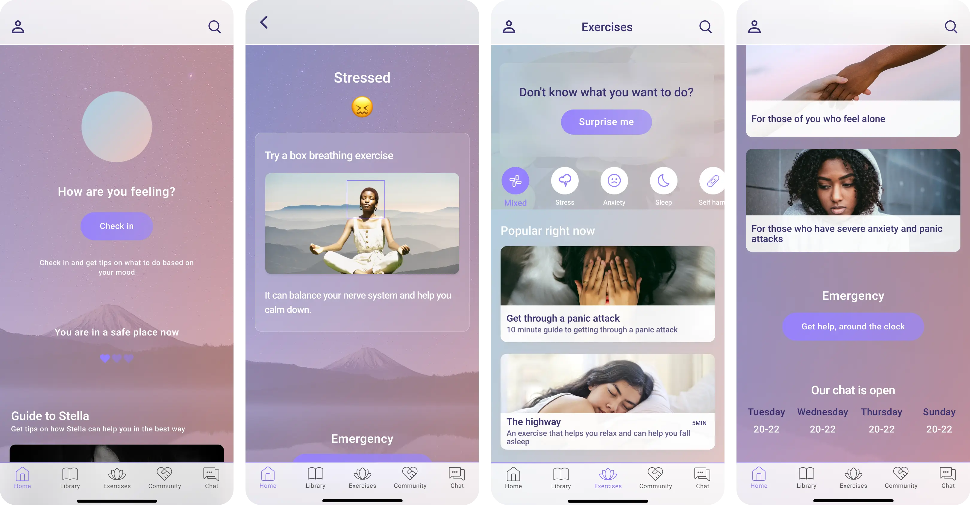
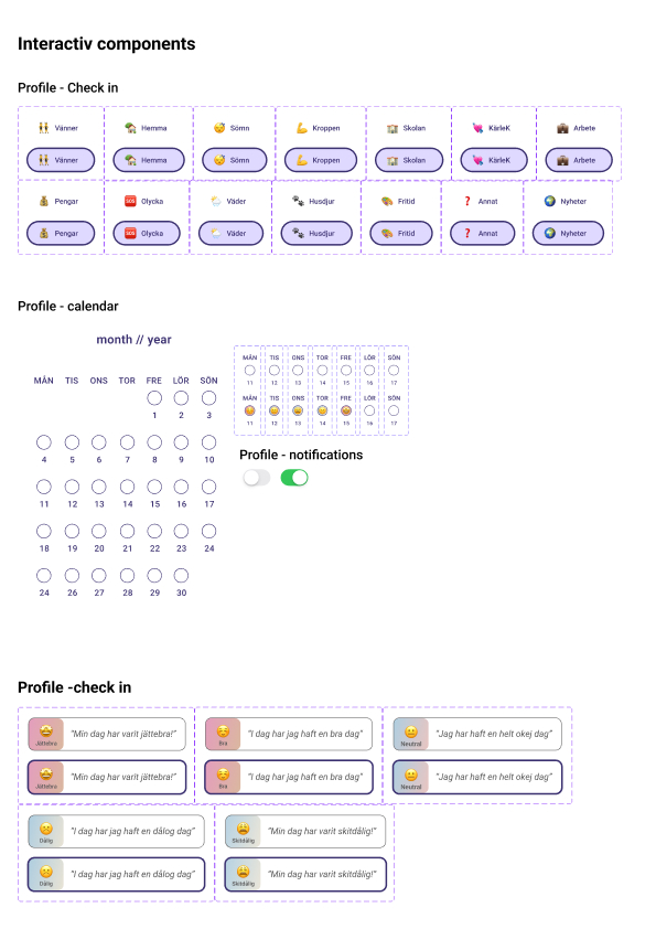
Reducing cognitive load when decision-making is hard
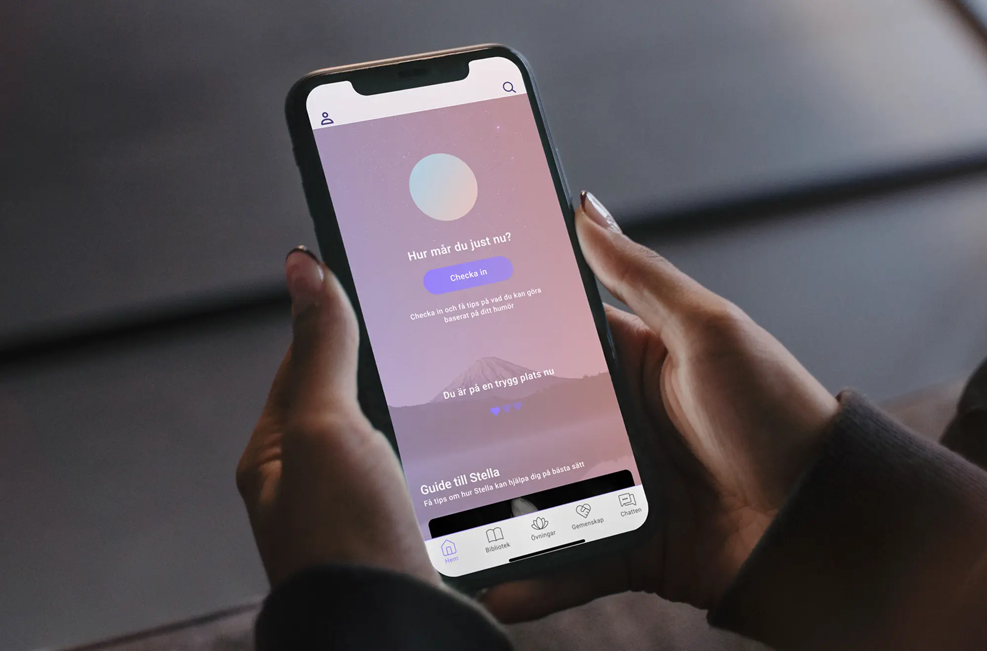
- Immediate check-in on the homepage
- One suggested action instead of multiple choices
- Randomized exercise option when choosing feels overwhelming
Helping users reflect & find patterns
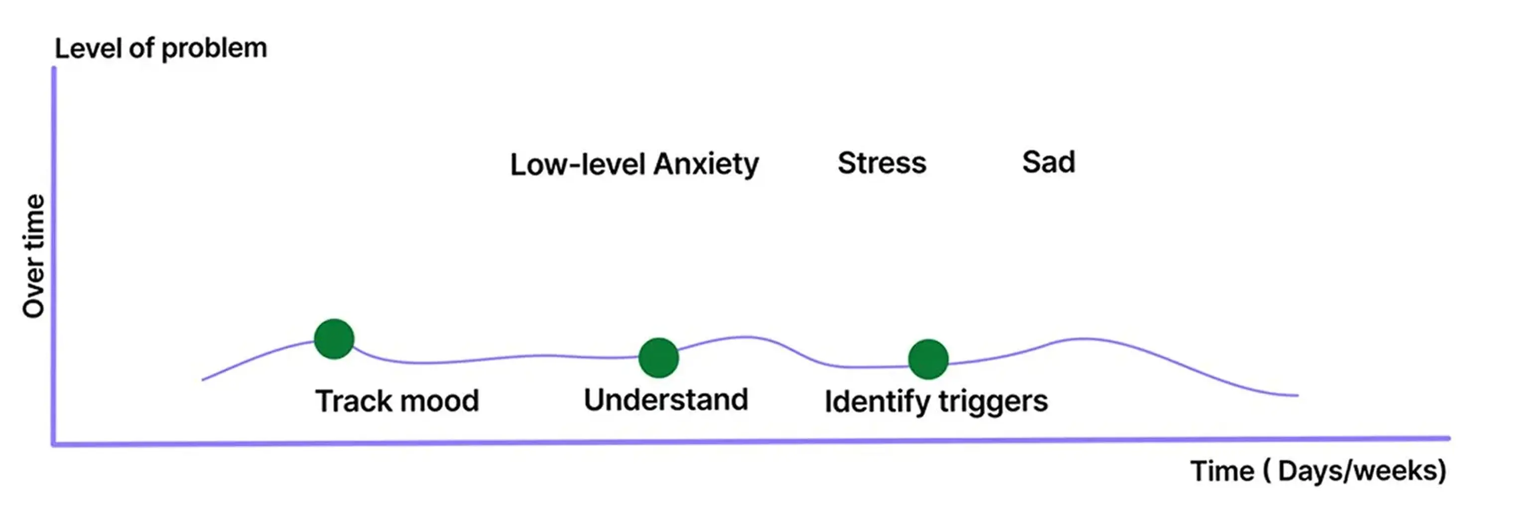
- Goal setting and gentle motivation without pressure
- Calendar and mood tracking to identify patterns over time
- Support for understanding why certain days are harder or easier
- Signals for when professional help may be beneficial after repeated difficult periods
Guidelines for Responsible Design
A research-based framework for digital self-help in high-risk contexts. Each guideline is mapped to functional impact, clarifying what is essential versus what adds meaningful value. This creates a shared foundation for building responsibly and consistently.
The framework is organized into:
Language, Material & content, Navigation, and Semantic structure
Understanding why support failed when users needed it most
The research phase focused on understanding how girls and young women actually experience self-help tools, emotionally, cognitively, and over time. The goal was not only to identify usability issues, but to uncover patterns in how support is avoided or abandoned. This allowed me to observe both what users said and what actually happened when they tried to use the product.
Participants:
- 100+ girls and young women
- Ages 10–25
- Current-users
- New-users
Methods:
- White paper research
- Surneys
- Competitive analysis
- In-depth interviews
- Usability testing and guided walkthroughs of the existing app
Making sense of what was actually happening
I synthesized all qualitative data through affinity mapping, clustering observations, behaviors, quotes, and emotional responses from interviews, surveys, and usability walkthroughs. In total, this resulted in over 2,000 individual data points, which made prioritization and trade-offs a critical part of the work.
Several patterns stood out:
Safety kept coming up as the most important thing
Not just technical security, but emotional safety, anonymity, tone, and a sense of control.
Motivation was closely tied to feeling understood
Users were motivated by seeing others’ experiences and by being able to shape the app around their own needs.
Personalization mattered more than I expected
Being able to save, organize, and return to content increased trust and made the app feel more personal and less clinical.
Usability issues directly killed motivation
Confusion (“Where do I start?”), hidden content (“I didn’t know there were exercises”), and long blocks of text often led to immediate disengagement.
Research revealed two distinct moments when users seek support.
This insight reshaped the product strategy: the experience needed to adapt its level of guidance, structure, and effort depending on when and why a user engaged.
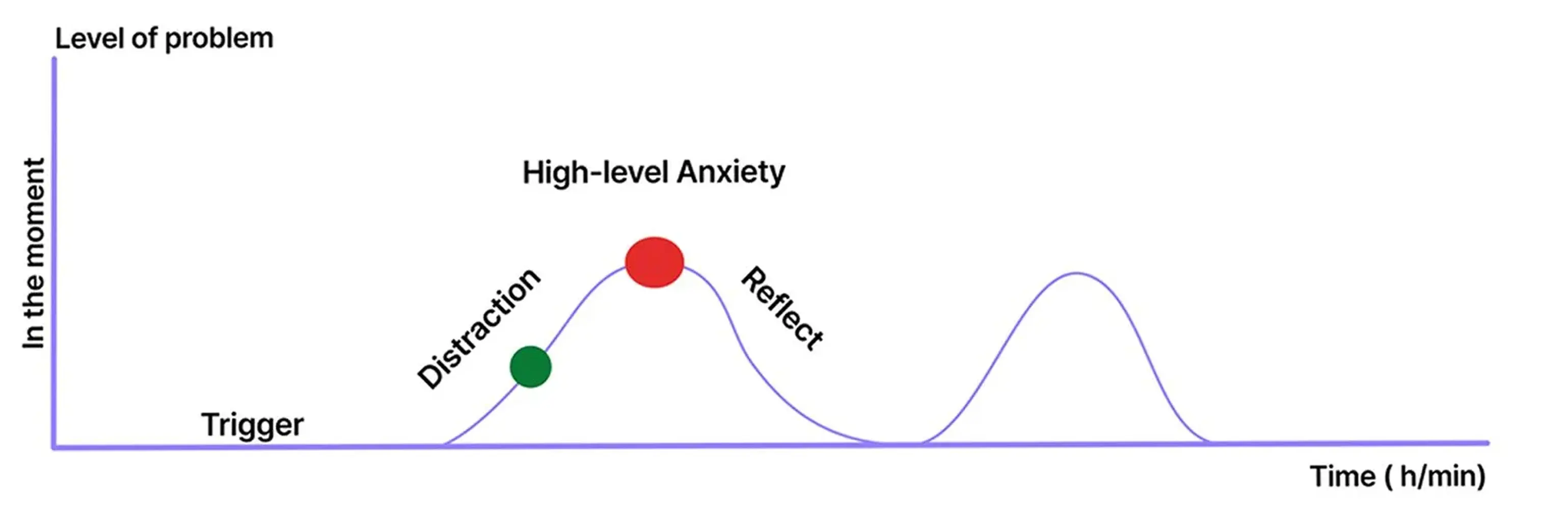
In-the-moment support
- Users felt overwhelmed and unable to make decisions
- They needed immediate clarity, emotional grounding, and very low cognitive effort
Over-time support
- Users were calmer and more reflective
- They needed tools to understand patterns, build motivation, and make sense of recurring emotions
This synthesis changed the direction of the project, and I asked myself:
How can support adapt to a user’s emotional state and motivation, without overwhelming or pressuring them?
That question became the foundation for the two-mode support model, the new information architecture, and the design guidelines that followed.
What if the real problem isn't the app, it's the system?
Initial ideation went big: What if we redesigned the entire healthcare pathway? The research was clear... users needed better access to care, not just a better app. Early concepts explored: AR/VR support experiences, direct healthcare system integration, and service design that bridges self-help and professional care.
Through stakeholder meetings, I quickly realized that even if some of the problems should be solved at a system level, this project needed to focus only on what could be achieved within a mobile app.
This phase shaped the first set of low-fidelity concepts and clarified which ideas were worth taking forward.
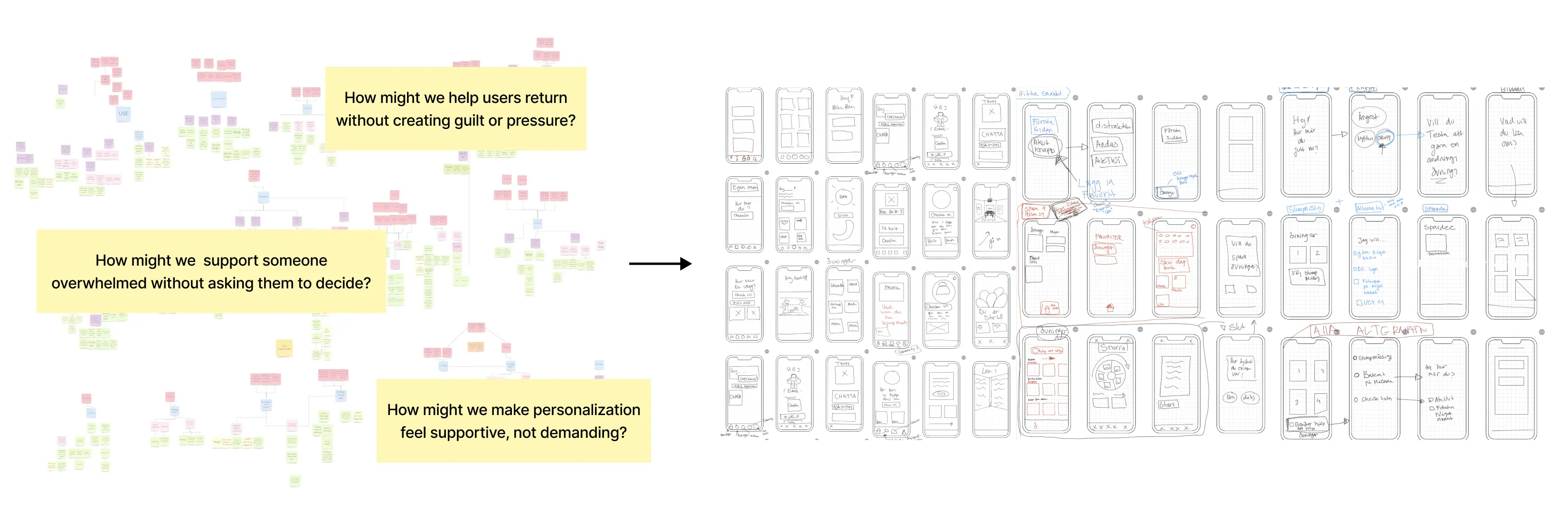
Iterating Early Concepts Through User Feedback
As ideas started taking shape, I tested early concepts through lightweight walkthroughs and feedback sessions. Testing these ideas surfaced important trade-offs that shaped the final direction.
This was an interactive prototype, and tested on mobile devices by five potential users aged 16–20.
Below are three examples where user feedback directly shaped the direction of the high-fidelity design.
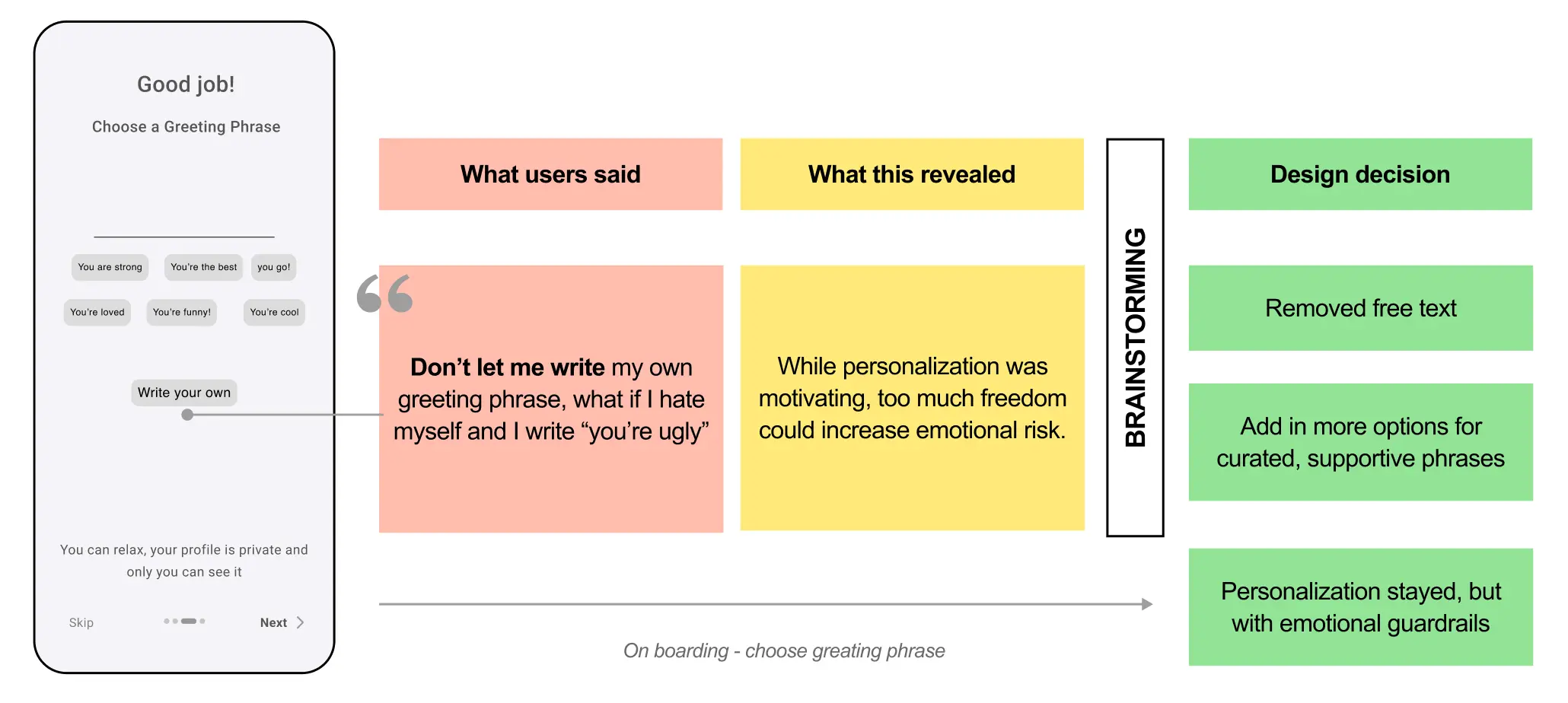
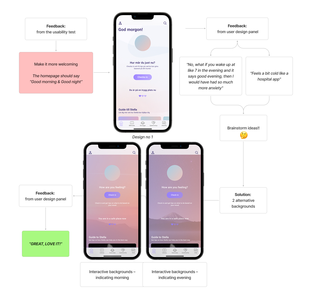
Personalization Needs Structure, Not Unlimited Freedom
Insight: Users want personalization and to feel seen
Initial idea: Let users write their own greeting phrase during onboarding
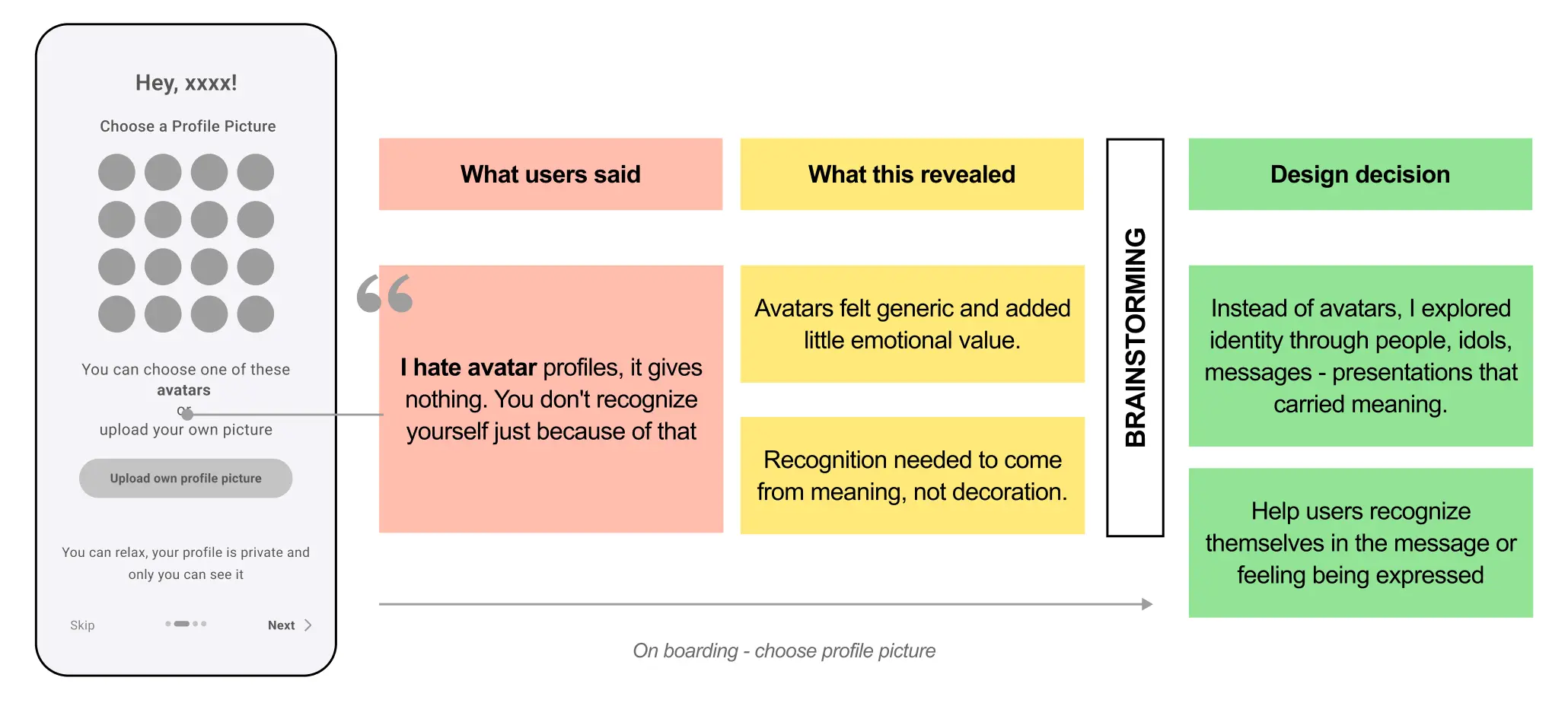
Identity Should Feel Meaningful, Not Generic
Insight: Users want to recognize themselves in the app
Initial idea: Avatars during onboarding to increase identification
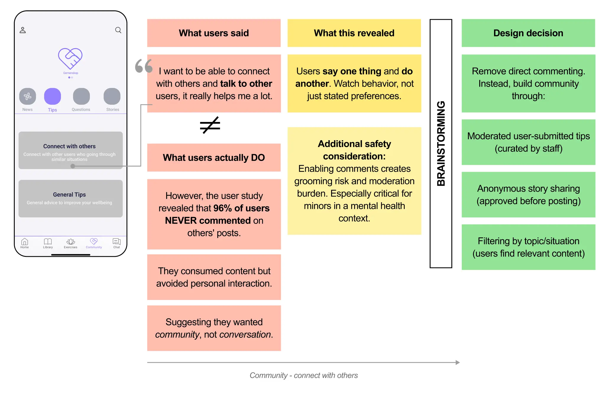
Community Requires Safety Over Expression
Insight: Support can come from others in similar situations
Initial idea: Enable comments to talk to and support others
Designing with users, not assumptions
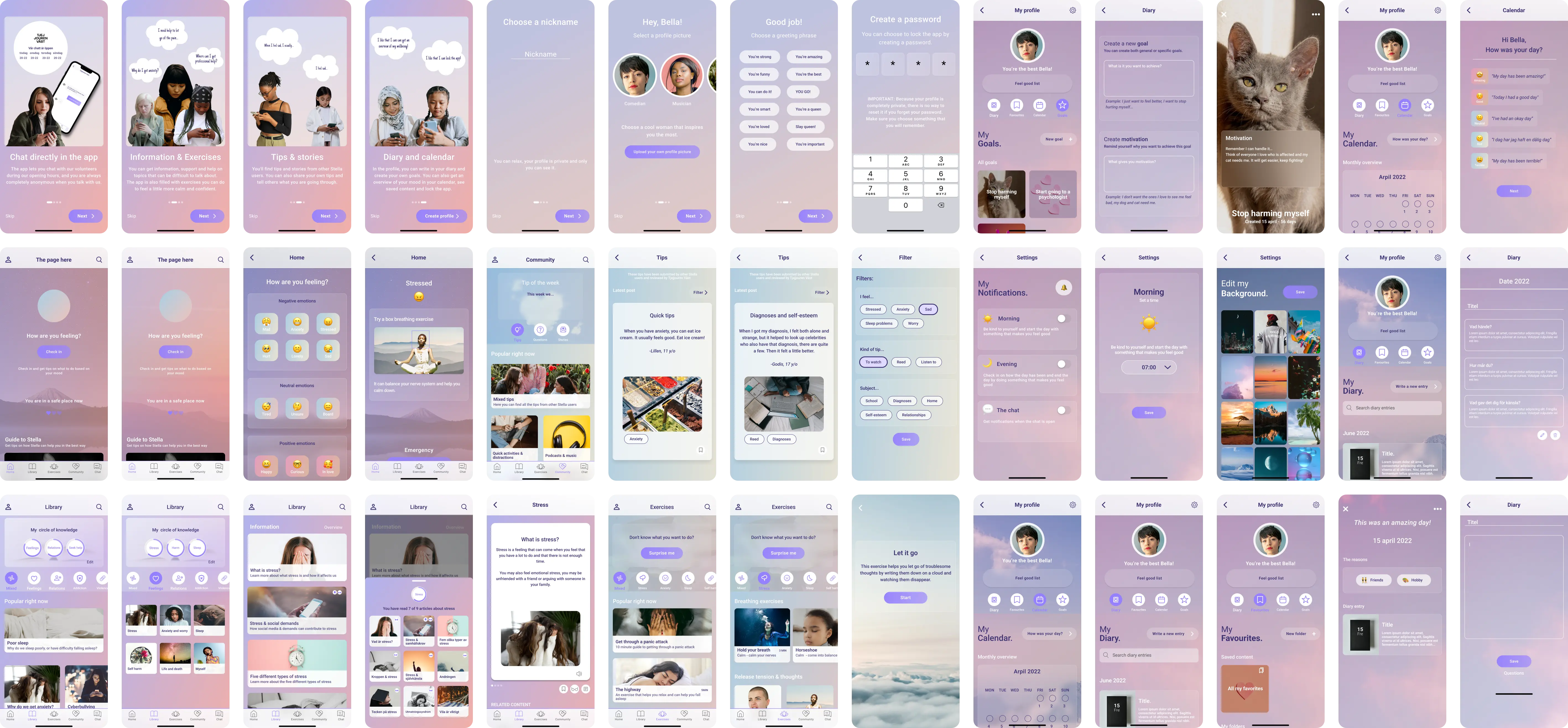
After iterating on structure, flows, and low-fidelity concepts, I moved into high-fidelity design. To ground the visual and interaction decisions, I created a small user design panel and used it continuously throughout this phase.
How it worked
- 7 participants
- Ages 16–18
- Used for quick feedback loops and lightweight A/B testing
- Compared alternatives for layouts, tone, colors, icons, imagery, and micro-interactions
Below is an example demonstrating how user feedback and design trade-offs shaped the final interface, specifically, the home screen design and messaging.
The Solution
The final outcome is a redesigned mobile experience that adapts to when and how users seek support. The new concept responds to users’ emotional state, cognitive capacity, and motivation, both in the moment and over time. By reducing cognitive load and clarifying pathways to help, the app becomes accessible precisely when users need it most.
The result is a system that feels:
- Safe when users are overwhelmed
- Supportive without pressure
- Personal enough to motivate return use
What was delivered:
- A new information architecture and user flow
- A two-mode support model (in-the-moment + over-time)
- A cohesive interface and design system
- Clear design guidelines to support future development
PS: All copy was translated from Swedish to English to better communicate the concept to an international audience. The translation is not always 1:1, which resulted in some alignment inconsistencies in the final design.
Two Support Needs, One Coherent System
Research showed users weren’t failing to engage because of missing features, they were seeking support in fundamentally different emotional states.
The solution is built around two complementary modes of support:
In-the-moment support
For users who are overwhelmed, anxious, or unable to decide.
- Minimal choices
- Clear next step
- Emotional grounding of information
- Randomized or guided actions to reduce decision fatigue
Primary surfaces
- Homepage check-in
- “Surprise me” exercise
- Emergency access is always visible
Over-time support
For users who are calmer and able to reflect.
- Progress tracking
- Emotional pattern recognition
- Motivation through meaning and personalization
- Gentle nudges toward help when needed
Primary surfaces
- Calendar & mood history
- Diary & saved content
- Goals and reflections
- Positive notification
User flow & Informational Architect
The original app exposed all content at once, increasing overload and hesitation. The redesigned architecture uses progressive disclosure and clear entry points.
Key structural decisions
- Fewer choices upfront, deeper content revealed gradually
- Navigation aligned with users’ mental models
- Easy re-entry without loss of context or progress
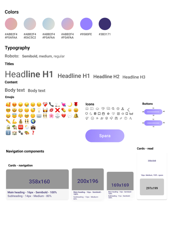
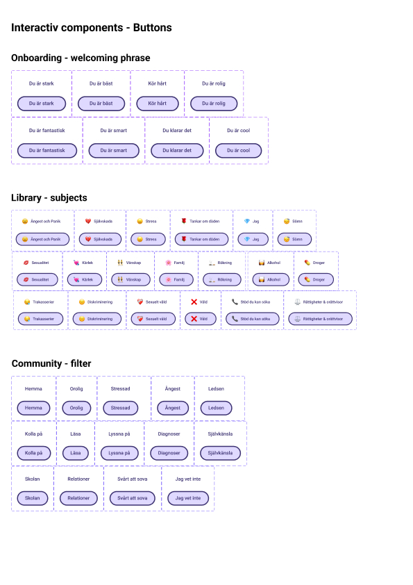
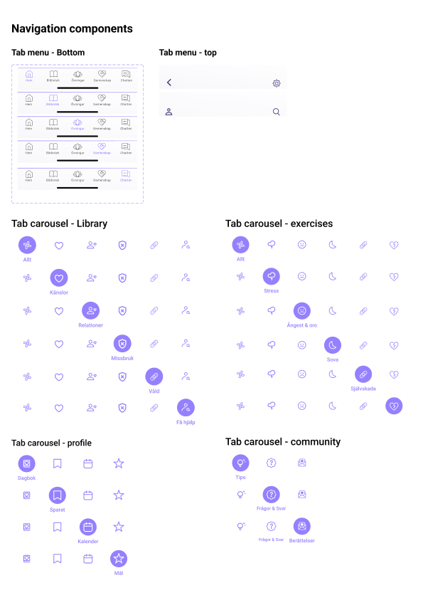
Design System & Guidelines
The design system provides clear direction for what should be included and how it should be designed, ensuring consistency across the app’s features, visuals, and interactions.
Final Usability Test: Validating the Direction
A final usability test was conducted on the high-fidelity prototype to evaluate whether the redesigned experience successfully supported users in both vulnerable moments and over time.
Test setup:
- 8 participants
- Ages 11–20
- In-person, mobile-based testing
- 30–90 minutes per session
- Task-based walkthroughs with follow-up questions
Reducing overload and hesitation at the first touchpoint
What I was testing
Whether onboarding could build trust and relevance quickly, while keeping emotional effort low.
Design focus
- Onboarding that clearly communicates purpose and safety
- Personalization through real people and role models to create recognition and inspiration
- Password protection to support privacy and emotional safety
What users told me
Participants described the onboarding as clear, light, and engaging.
Seeing real people and role models made the experience feel more meaningful and relatable than generic avatars, without requiring users to expose themselves or make difficult choices.

Supporting users in moments of vulnerability
What I was testing
Whether the homepage could feel welcoming and emotionally supportive, while helping users know how to begin during moments of stress or overload.
Design focus
- A warmer, more calm homepage
- Reduced text and clearer visual hierarchy to lower cognitive load
- Immediate check-in on the homepage to guide users
- Navigation patterns and labels aligned with users’ mental models
What users told me
The homepage felt calm, welcoming, and easier to understand.
Users knew where to start without feeling pressured, and the check-in helped them move forward without having to think too much.
Supporting reflection and learning over time
What I was testing
Whether educational content could stay accessible and motivating over time — without becoming overwhelming or demanding, especially when users return in different emotional states.
Design focus
- A feed-based structure that surfaces relevant content without requiring search or planning
- Bite-sized, swipeable articles to reduce cognitive load
- Multiple ways to engage (read, listen, save) depending on capacity and preference
- Progress visibility to support motivation without pressure
What users told us
The Library felt usable and easy to return to. Users understood how to save content, pick up where they left off, and track what they had already explored, without feeling overwhelmed.
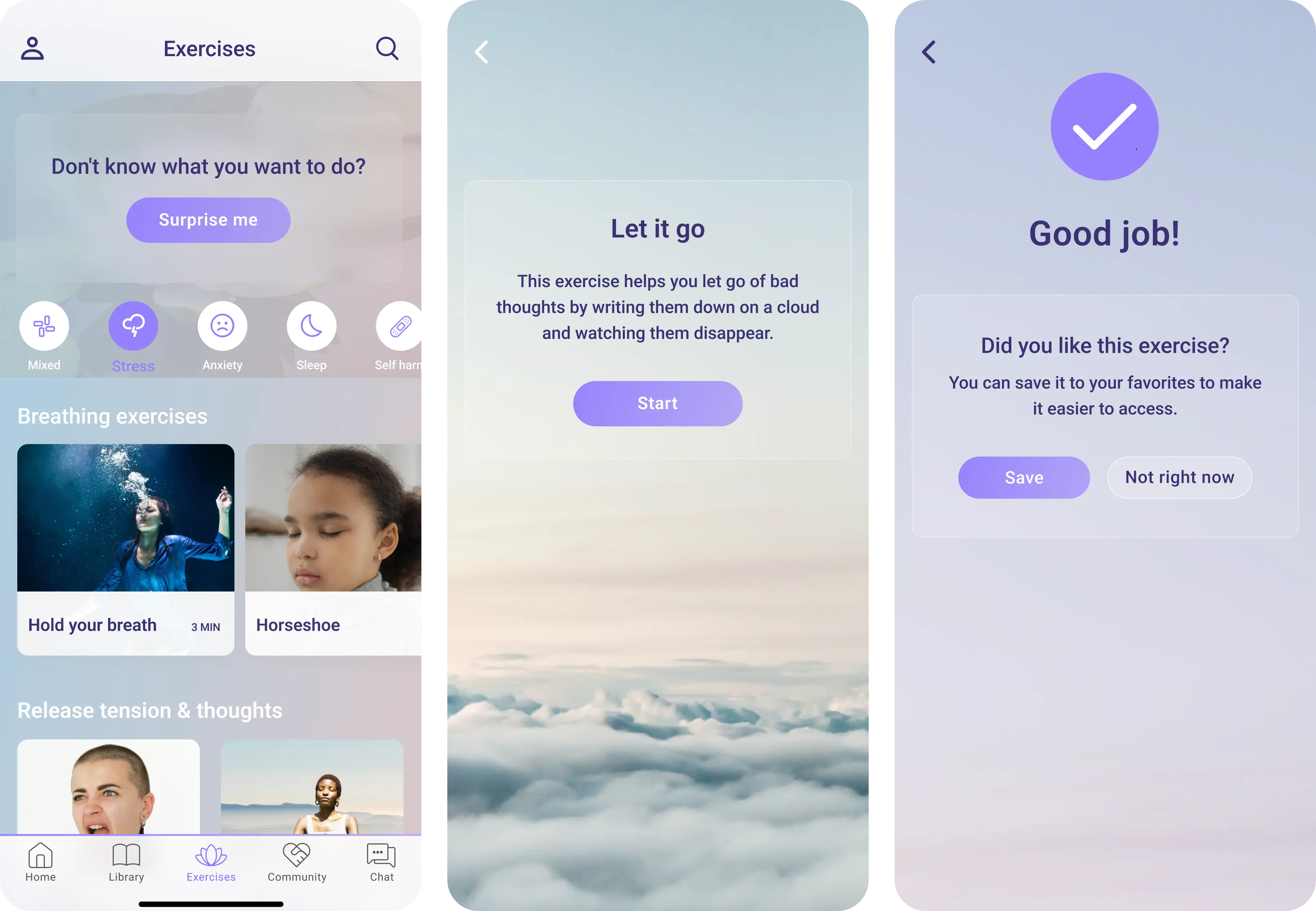
Reducing decision fatigue while supporting regulation over time
What I was testing
Whether users could start an exercise quickly during moments of stress, and still return to exercises over time without feeling bored, pressured, or overwhelmed.
Design focus
- A feed-based structure that mirrors the Library for familiarity and ease
- Clear start and end points to create a sense of completion
- Short, interactive exercises using visuals and limited text
- A randomized “Surprise Me” option to remove decision-making when capacity is low
What users told me
They found the exercises more engaging, easier to complete, and especially valued the random option on harder days when thinking felt difficult.
Supporting motivation and connection without compromising safety
What I was testing
Whether connection with others could increase motivation and a sense of belonging, while remaining safe, moderated, and appropriate for a vulnerable user group.
Design focus
- Community structured around shared experiences, not direct messaging
- Moderated content to reduce risk and maintain trust
- Tips, stories, and Q&A to support both in-the-moment reassurance and over-time motivation
- Light identity cues (name and age) to increase relatability without exposing users
- Recurring content (weekly tips) to encourage return visits
What users told us
The Community felt meaningful and safe. Seeing names and ages made stories feel more personal and relatable, without making users feel exposed. Participants described the Community as an important and motivating part of the experience over time.
Supporting ownership, reflection, and motivation over time
What I was testing
Whether long-term support features could feel personal and motivating, without becoming heavy, demanding, or easy to abandon.
Design focus
- A single profile space that brings together reflection, tracking, and personalization
- Quick access to saved content for in-the-moment support
- Calendar-based reflection to help users notice patterns over time
- Motivation through gentle reinforcement, not pressure or streaks
- Personalization that makes the app feel theirs, without extra effort
What users told me
Being able to save content into folders, reflect on patterns in the calendar, and adjust visuals and notifications helped users feel ownership, and supported both quick relief and longer-term growth.
When asked whether they would use the app or recommend it to a friend, every participant said yes.
“YES ! I need this, and I want it now.”
Designing support that adapts, not demands
Stella struggled to support users in moments of emotional overwhelm. I addressed this by redesigning the structure, introducing clearer entry points, expanding relevant features, and aligning the experience with users’ emotional state and cognitive capacity.
Reflections & next steps
Looking back, there are interface-level details I would refine today, such as tighter visual hierarchy in some views, clearer CTA emphasis in specific flows, and more consistent spacing and alignment in high-density screens.
However, this work was intentionally positioned as a directional foundation, not a locked final product. The redesigned app that followed was built on these principles, structures, and insights.
What mattered most, and still holds, is the underlying approach:
designing for emotional context, cognitive load, and motivation, and letting user behavior (not assumptions) guide every decision.

Final reflection
This project shaped how I think about UX at a systems level.
It taught me that meaningful design isn’t about adding more, but about knowing when to guide, when to step back, and how to support people when their capacity is lowest.
Working in a mental health context forced every decision to be intentional. Listening to users talk about vulnerability and trauma pushed me to design with care, restraint, and responsibility, especially around language, hierarchy, and choice.
More than anything, Stella clarified the kind of work I want to do: design that adapts to people, not the other way around.
Final thoughts:
The wellbeing of girls and young women must be a priority, not just in design, but in the healthcare system as a whole. It's not enough to provide basic functionality or surface-level support. They deserve real care, real tools, and a system that meets them where they are. Something more than just functional. Something meaningful.