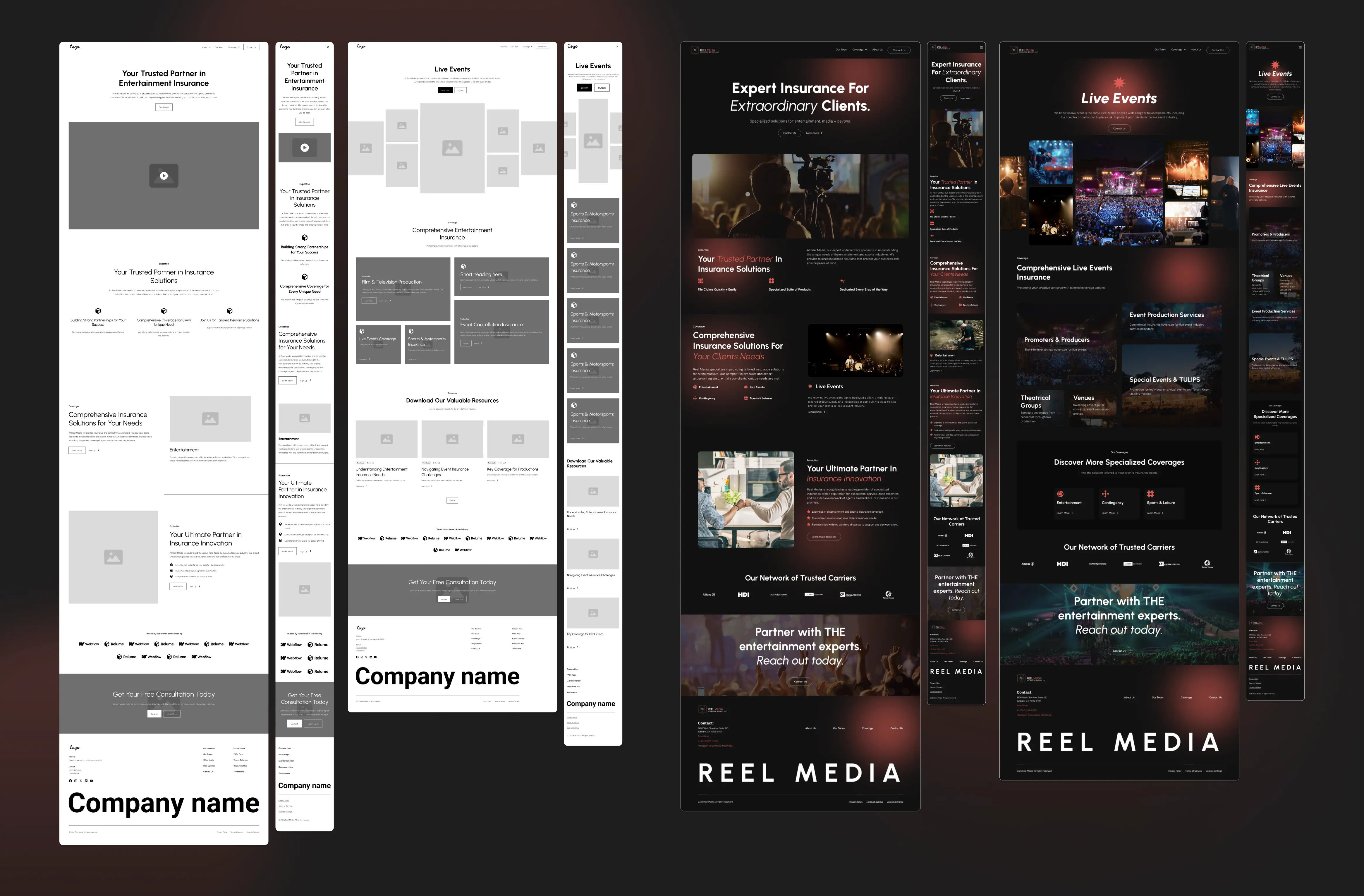
Designing Trust and Conversion in Entertainment Insurance
Reel Media is an insurance agency serving the entertainment industry, where trust and timely decisions are essential. The previous website did not reflect the people of Reel Media, the brand’s identity or their industry expertise.
I was the lead designer on the project, handling UX strategy, visual design, and the Webflow build, working closely with a project manager. Our goal was to create a top-tier website that made complex insurance easy to understand, built trust fast, and captured the feel of the entertainment industry without looking too corporate.
75%
Increase in qualified leads generated
40%
Reduction in bounce rate
Insurance needed to feel credible without feeling corporate
Reel Media works in a field where trust is essential, but personality is important too. Insurance usually relies on conservative, corporate design to show reliability, but that can feel distant, generic, and out of place for the entertainment industry.
How do you reflect the entertainment industry in the design while still signaling seriousness and reliability at first glance?
A conversion-focused website built on trust and personality
The final site makes complex insurance easier to understand by designing it for the entertainment industry, not around generic insurance norms. Strong visuals, clear structure, and familiar industry cues build trust quickly and support conversion.
What was delivered
- A user-centred information architecture built around primary user intents and conversion paths
- A fully responsive Webflow site with custom interactions that guide attention and support scanning
- A cohesive visual system that blends bold design with confidence and personality
- Industry-specific visual cues that express personality without undermining trust
Building trust by understanding context
As always, I started the project by conducting preliminary research to understand the context, how people use insurance sites in the entertainment industry, and what specific user needs they might have.
Methods
- Stakeholder interviews
- Competitor analysis
- Analytics review
- Desk research and industry context
In general:
- Over 75% of users accessed the site on desktop
- The team page plays a major role in trust-building and conversion
- Most competitors leaned into corporate designs that feel safe but disconnected from entertainment
Interesting finds:
How people actually browse
What I observed: When looking beyond insurance, I noticed a disconnecion, users gravitate toward darker, confident, and tech-forward experiences online, but insurance defaults to light and "safe".
How I interpreted this: That gap made me think that trust doesn't require looking corporate. For an entertainment industry client, it meant understanding their visual language.
Motion needs a reason to exist
What I observed: Users liked websites that included animations and movement, until they didn't. When everything moves, it quickly becomes noise and overwhelming.
How I interpreted this: Not everything needed to be hyper-animated just because it's entertainment. Motion can reference the industry subtly while guiding attention and creating recognition. Maybe it could even help to build trust?
Professional without feeling corporate
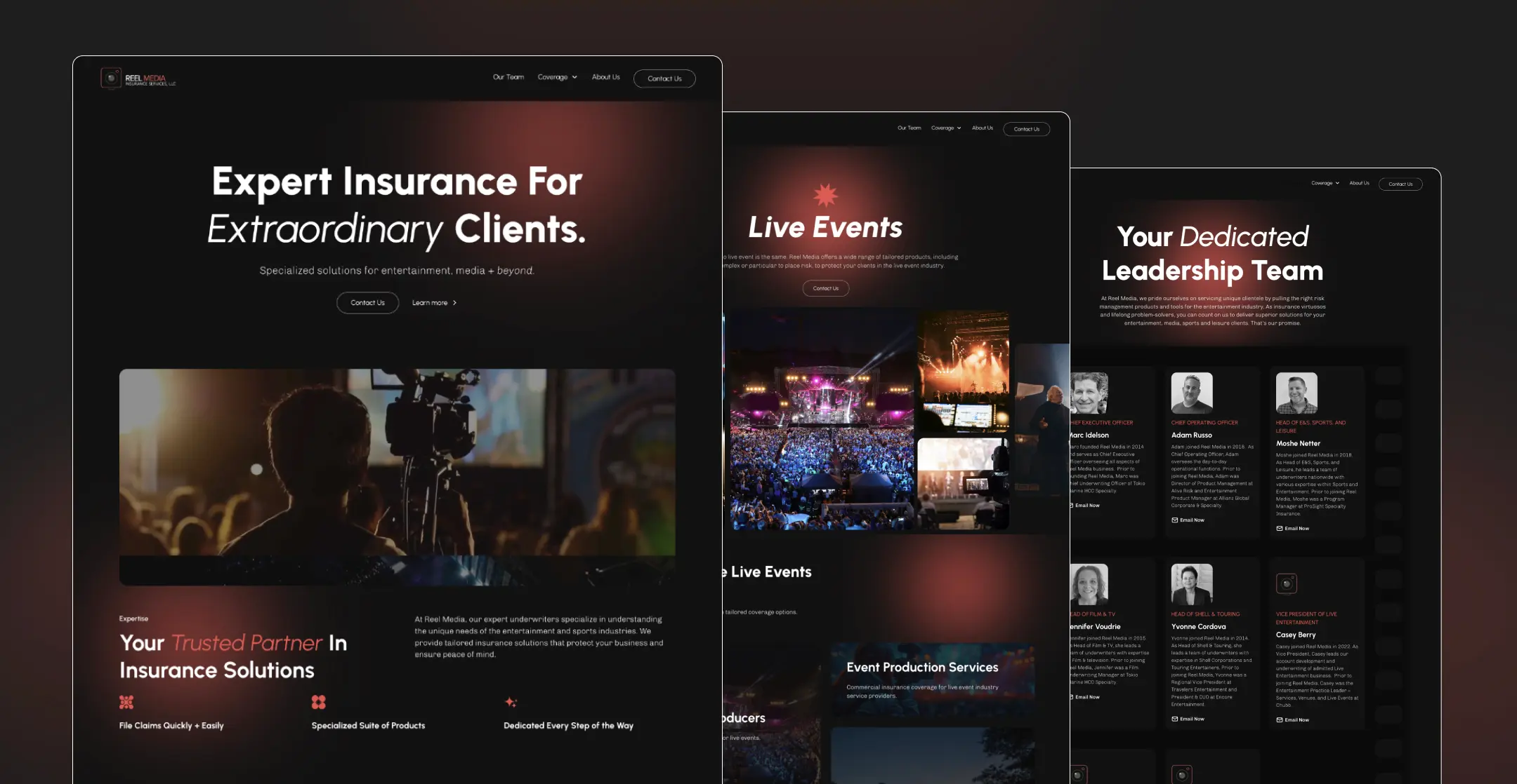
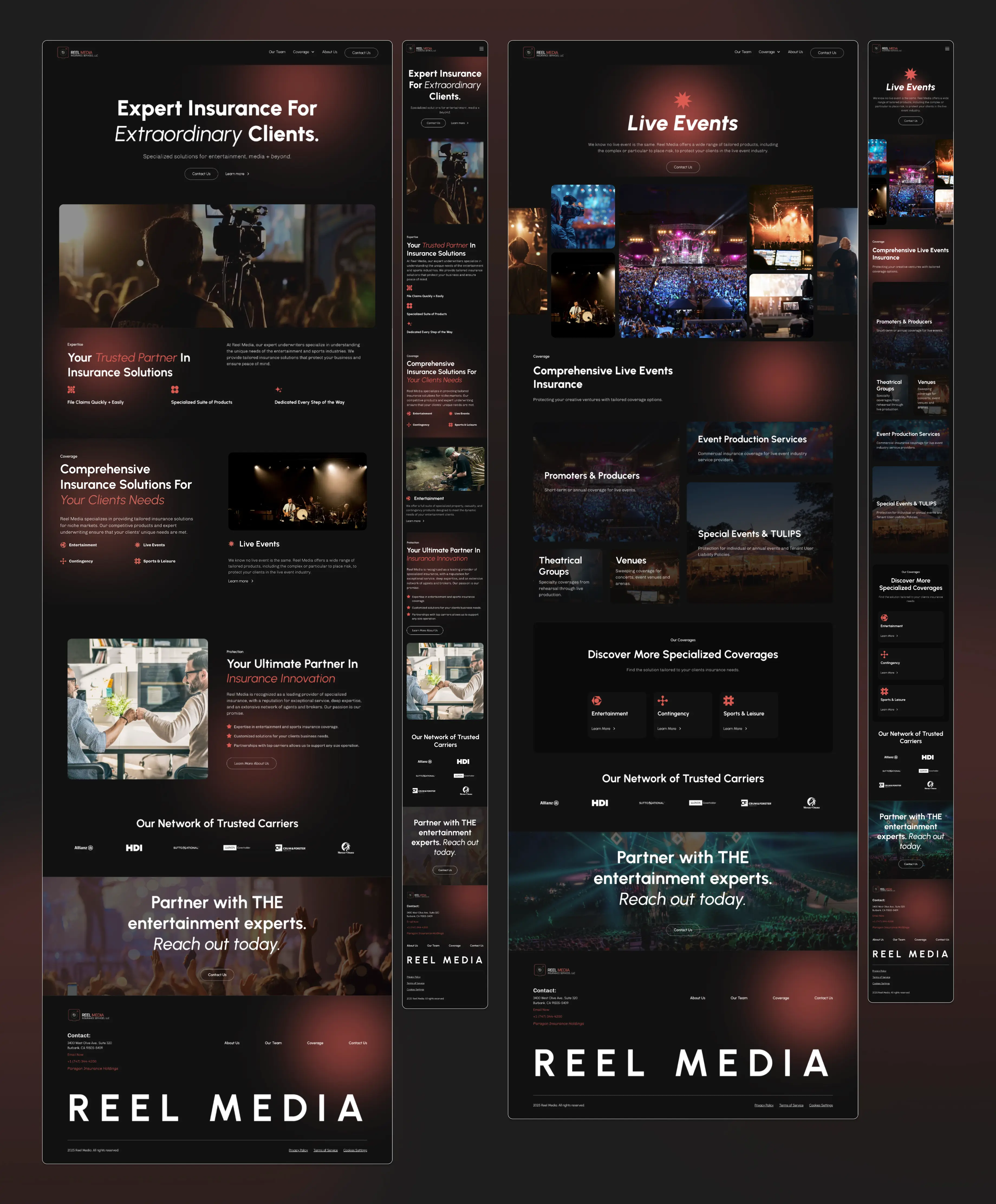
After the research, I started moodboarding to explore the site’s look and feel. We tried a few directions and refined the tone with the client over several rounds. This is the final visual direction we chose.
The research made it clear that credibility doesn’t have to look corporate. For an entertainment-focused insurance brand, trust can come from using the industry’s visual style. So, I chose a darker, more cinematic look to match how users already interact with brands they trust online.
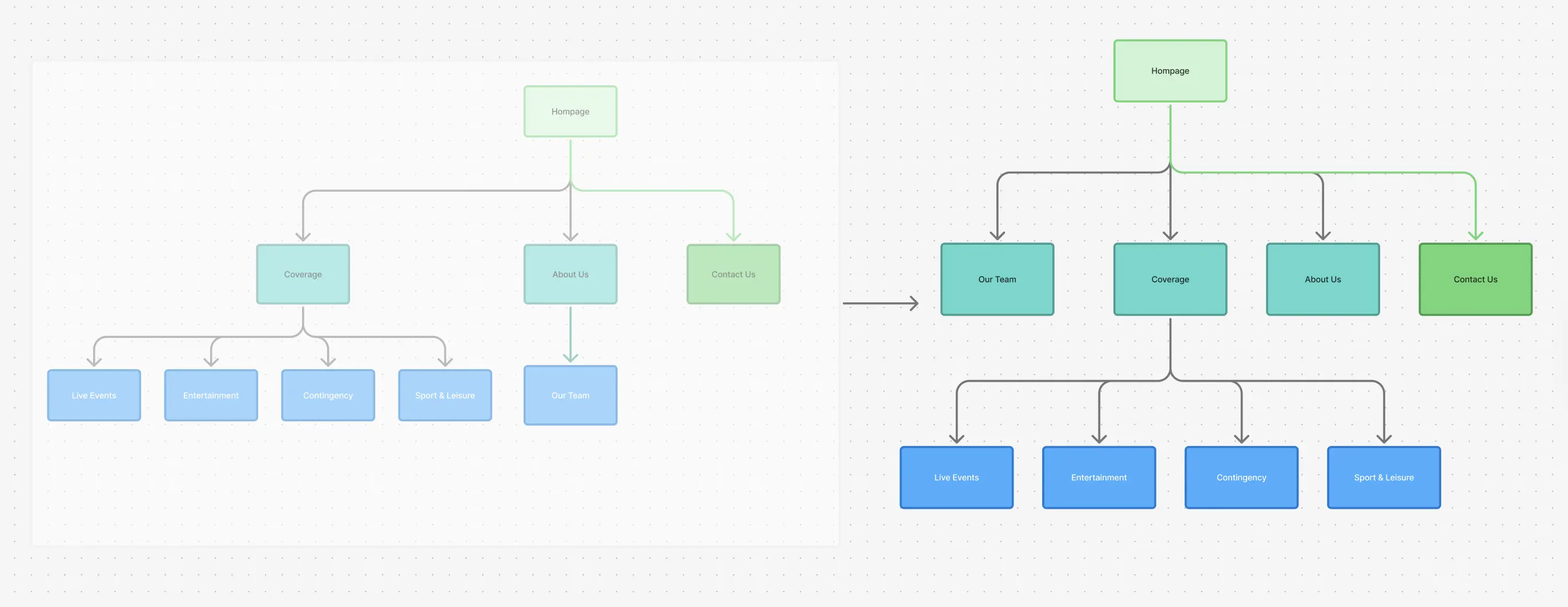
Structure that follows behavior
Once the direction was set, I focused on how users actually move through the site.
Initially, I placed the Team page under the About Us section, since this is a common pattern, but the research reminded me that in this industry, people reach out directly to individuals. So technically, the Team page isn’t secondary content; it's a conversion path. So I moved it to the top navigation to match how users actually behave.
From Structure to Execution
I then moved into ideation and wireframing to establish structure and hierarchy. This was an iterative process, working closely with the client to refine layouts before moving into high-fidelity design. Since I was also responsible for building the site, every interaction and layout decision was made with Webflow in mind to keep the experience fast, responsive, and easy to maintain.
I also used tools like Relume and AI-assisted workflows to move quickly. This freed up time to focus more on the creative side of the work, like refining interactions and adding detailed micro-interactions that would have been difficult to achieve within the project timeline otherwise.
A site that builds trust by understanding the industry
The final site makes complex insurance easier to understand by designing it for the entertainment industry, not around generic insurance norms. Strong visuals, clear structure, and familiar industry cues build trust quickly and support conversion.
Where research turns into experience
Here are a few selected screens that show how I think as a designer, and how each decision ties back to the research. Nothing here is random; every detail is considered and connected to user behavior and business goals.
Recording-light presence
In the hero section of the interior pages, a subtle pulsing red glow references the recording light used on set. It’s a familiar industry cue, abstract enough to stay clean, and used to add depth without distraction.
Film-roll team layout
The team page avoids a standard grid and instead references a film roll. This reinforces industry familiarity while keeping the structure clear and scannable. It also supports the team’s role as a key conversion path.
Spotlight interaction
A soft spotlight follows the cursor, inspired by stage lighting. It adds subtle movement, guides focus, and reinforces brand recognition without interfering with content.
Designing meaning down to the details
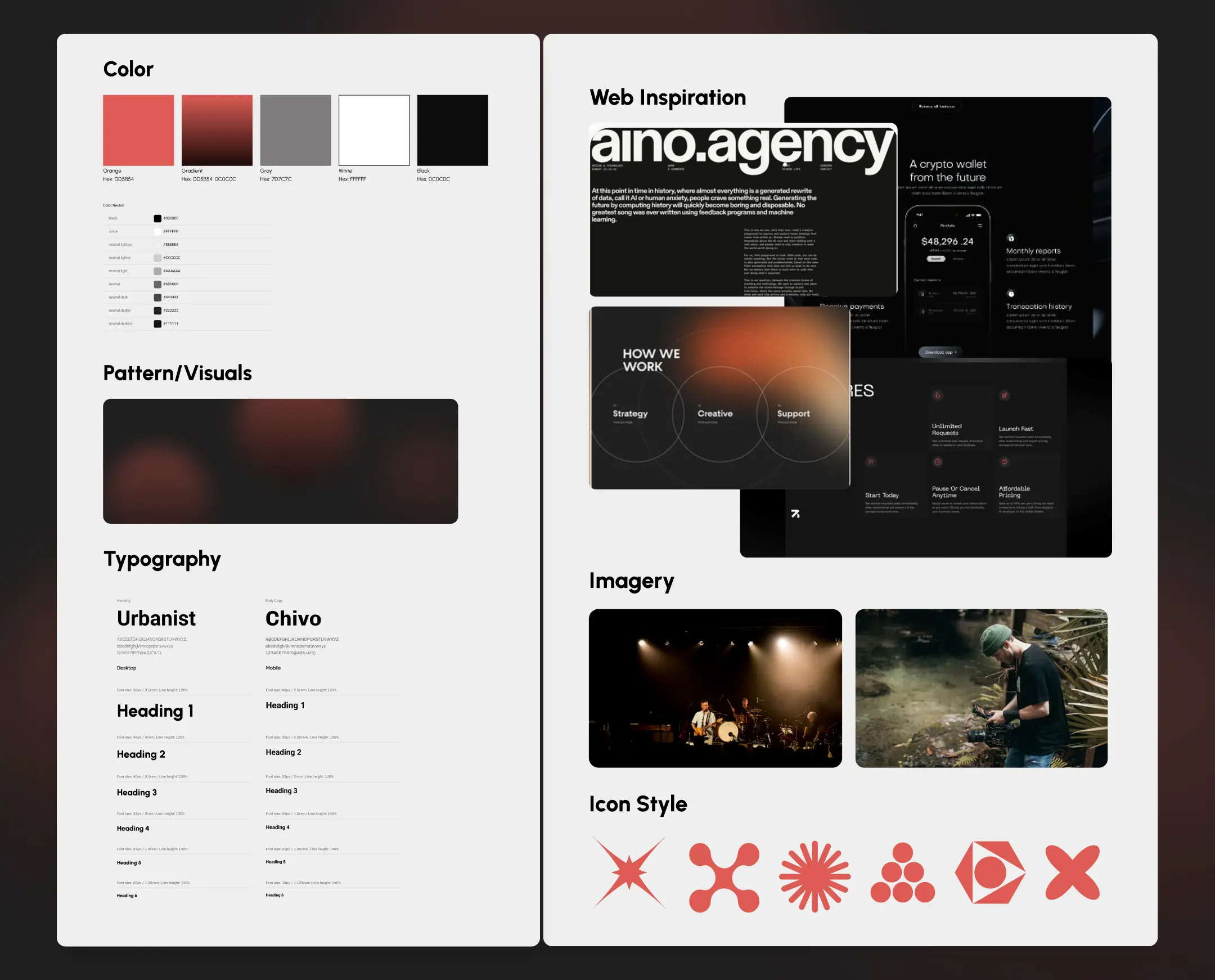
The icon system is intentionally abstract. Rather than illustrating categories literally, each shape communicates tone and context, allowing meaning to emerge without adding visual clutter.

Entertainment
Inspired by a camera lens opening, connecting directly to the visual and creative aspects of the entertainment industry.

Live Event
A spiked star with nine points, expressing energy, excitement, and shared experiences. The form reflects the emotional intensity and collective nature of live events.
Contingency
A blob-like cross. Reflects the fluid, unpredictable nature of contingency planning , almost like molecules shifting under a microscope.

Sport & Leisure
Four interconnected half circles forming a square. Could read as balls, tracks, teamwork, or even an abstract scoreboard.
Final reflection
This was my first project where I designed and built everything in Webflow from start to finish, and I’ve grown a lot since then.
Looking back, there are things I'd tighten, like the CTA hierarchy could be clearer, and I'd spend more time on accessibility. But the core problem got solved: we turned a corporate-feeling site into something that feels like it belongs in entertainment, and it worked. Leads went up, bounce rate dropped. The client called the final site "sexy," which honestly felt like proof that even insurance doesn't have to be boring if you actually understand the people using it.
The project shows how thoughtful decisions, even small ones, can make something functional feel intentional.